Home Page Redesign
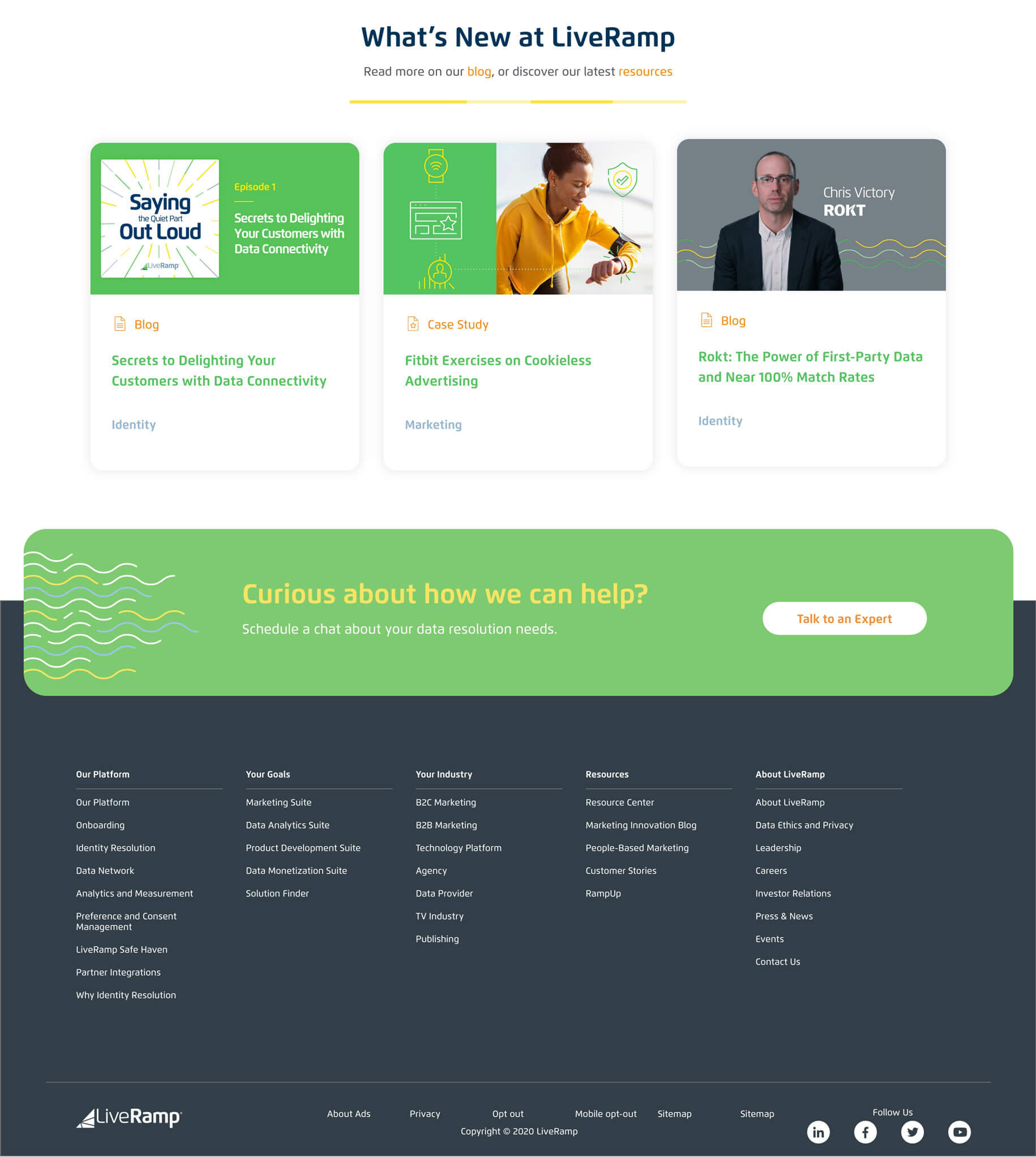
As LiveRamp transitioned from a startup to a SaaS company, it became apparent that the abstracted collage style of the old hero banners no longer suited the look and feel of the brand. Rallying around the idea of simplicity, the redesign of the home page was a small win with a big impact.
Impact
Working through a new illustrative style for the hero, I presented design mockups to key leadership stakeholders and got buy-in on a singular direction. After final design, I partnered with the internal web team for the build.
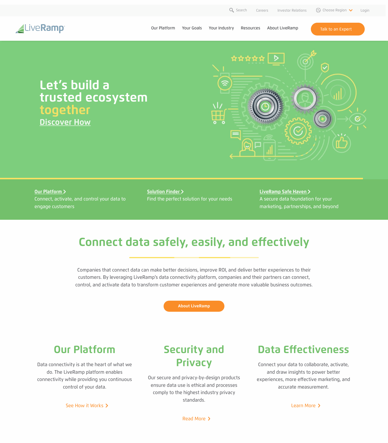
Challenges of the old design
-
Hero banner was too tall, pushing key content even further down the page.
-
Abstracted, complex visual collage style did nothing to help explain LiveRamp’s products.
-
While a primary brand color, here the green color block was overwhelming and pulled attention away from the content.
-
Nothing on the page read as SaaS, or even software—the imagery was too consumer-focused.
-
It wasn’t clear from the page what LiveRamp did or sold.
Opportunities of the new design
-
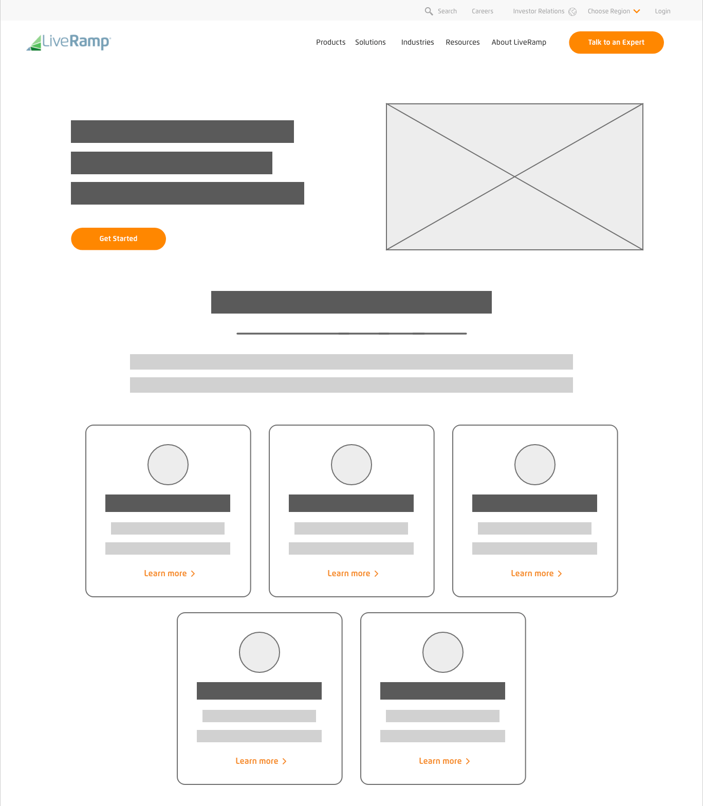
Reduce the overall visual elements so they cannot compete for attention.
-
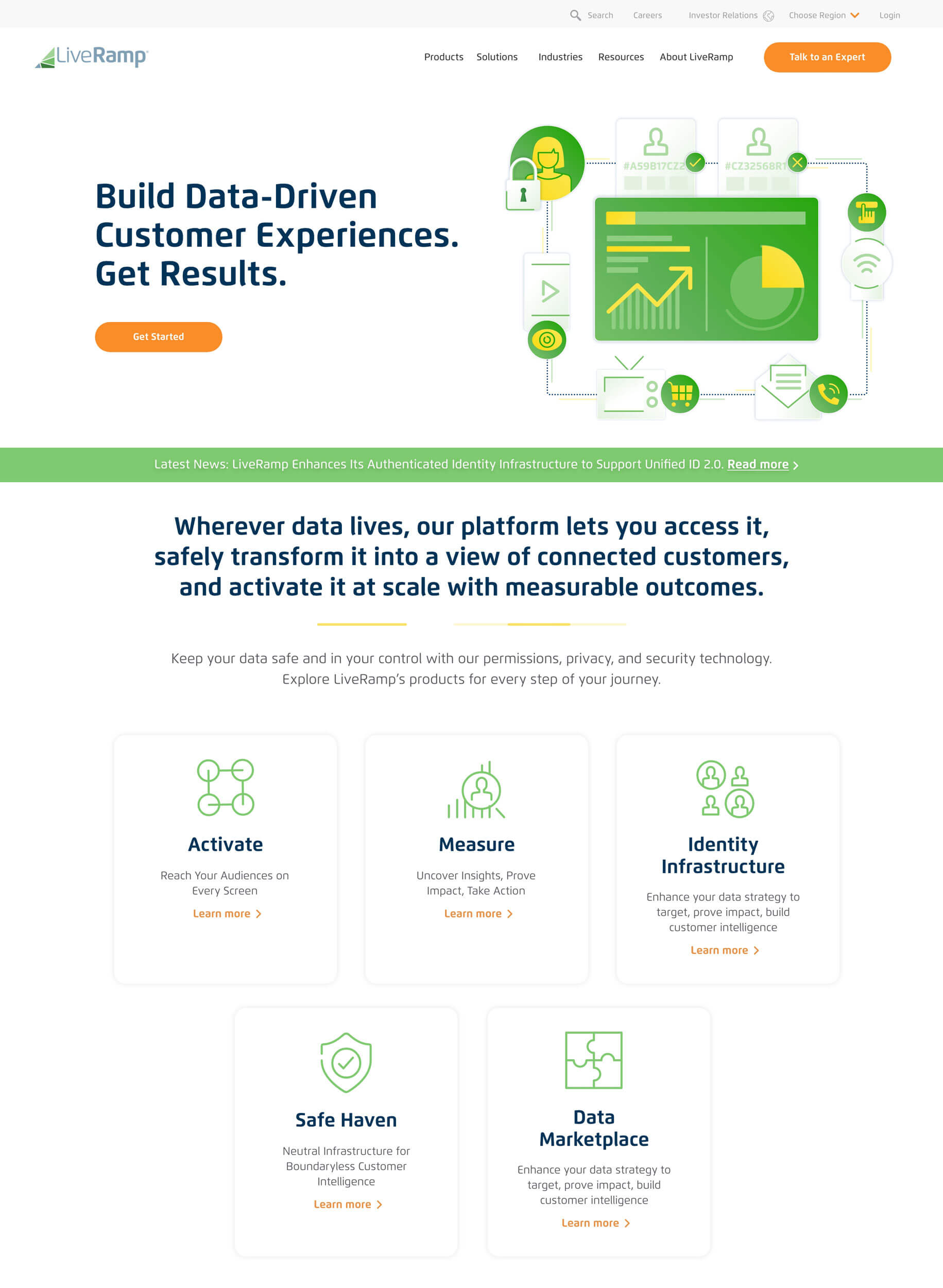
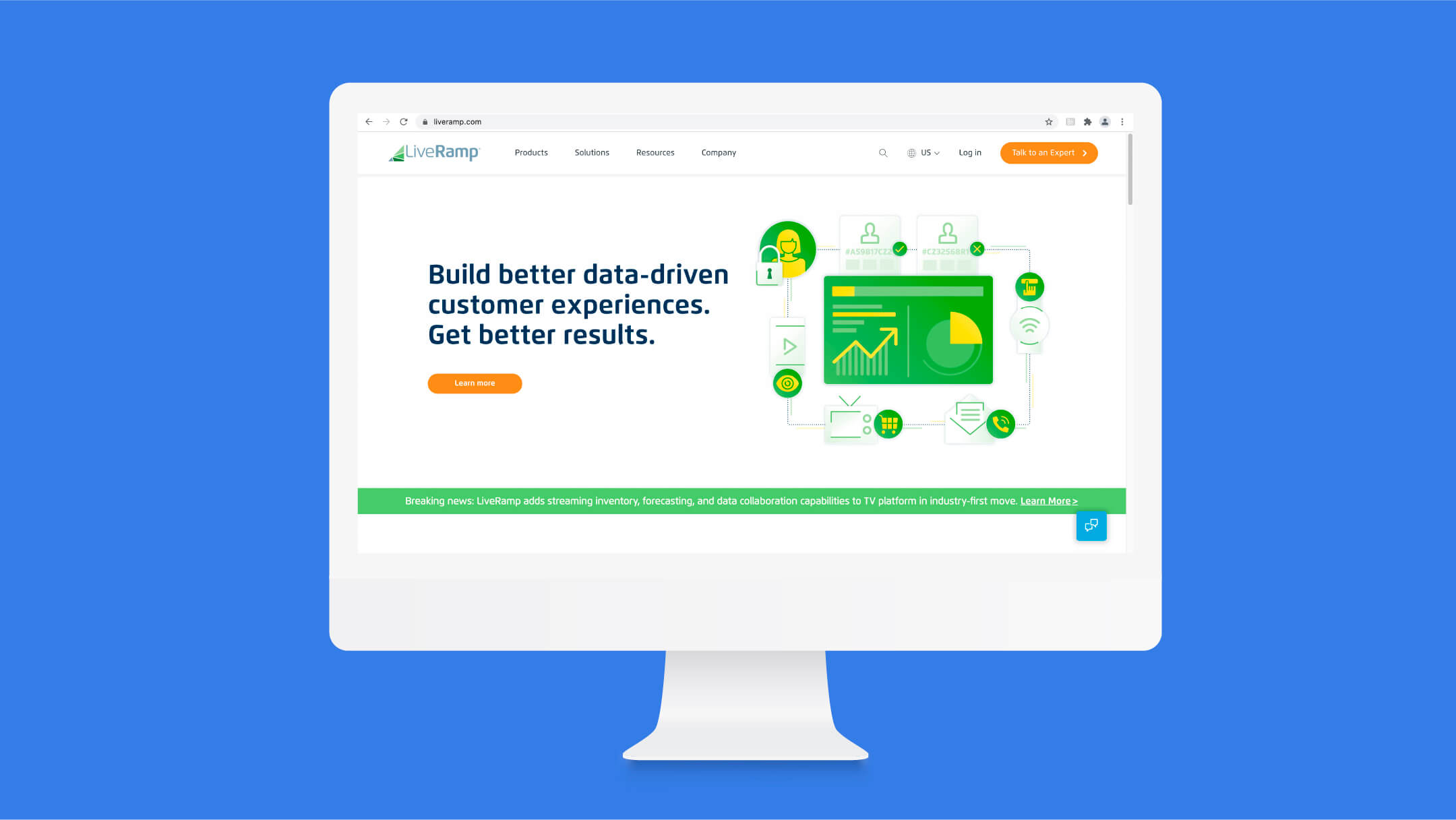
Create a hero illustration that showcases the products front and center.
-
Focus on clean, clear simplicity, and move up lines of business near the top of the page for better visibility.
-
Evolve existing brand towards a SaaS look and feel to anchor LiveRamp in the industry.
-
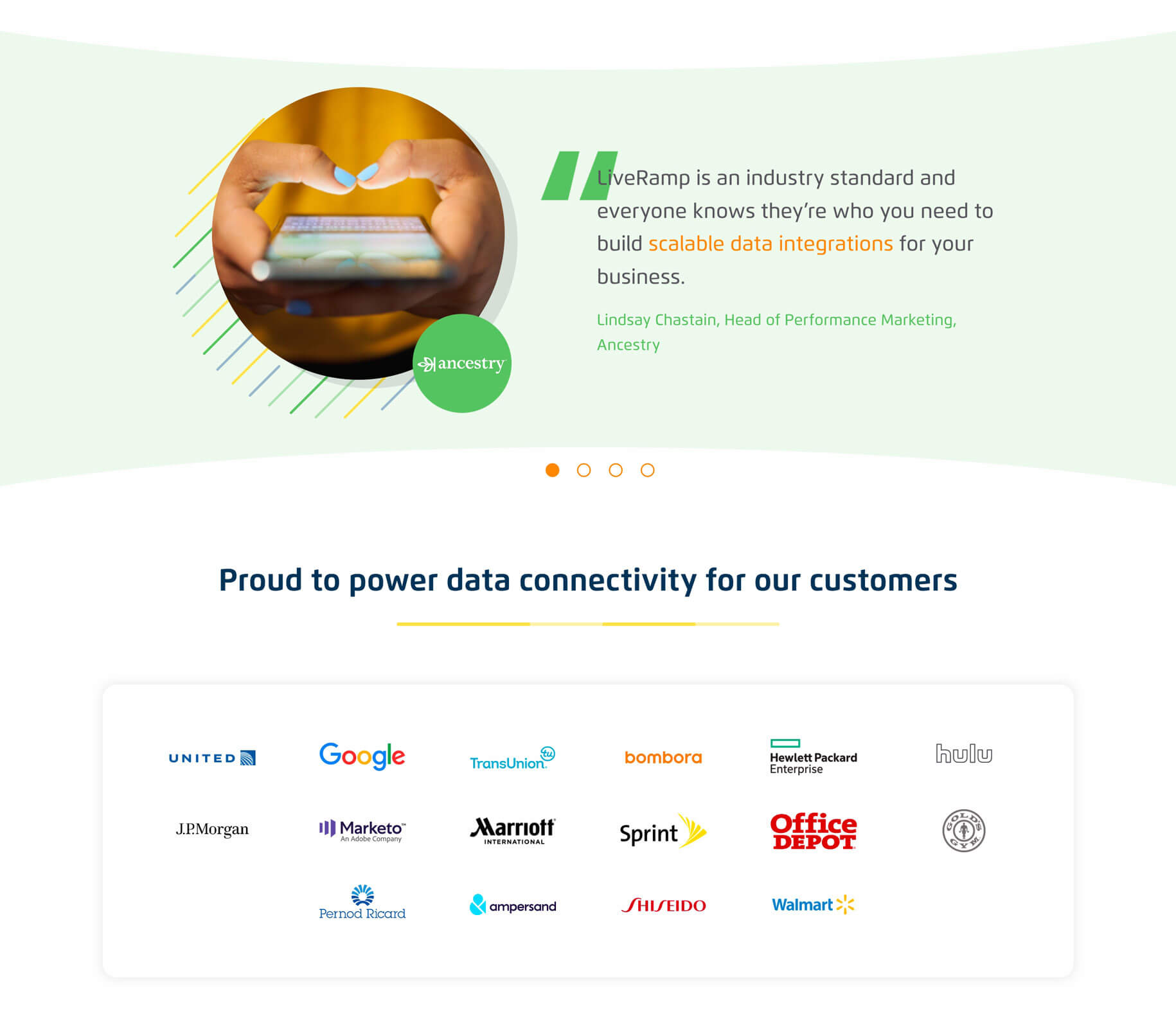
Begin to tell the company story successfully.
Initial visual exploration
Since a crucial component of the homepage would be a new hero illustration, it made sense to nail that visual style first. The original iconographic style of the brand was flat and outlined—was there a way to add some dynamism, dimension, and SaaS sophistication that felt true to LiveRamp without straying into hokey or trendy territory?


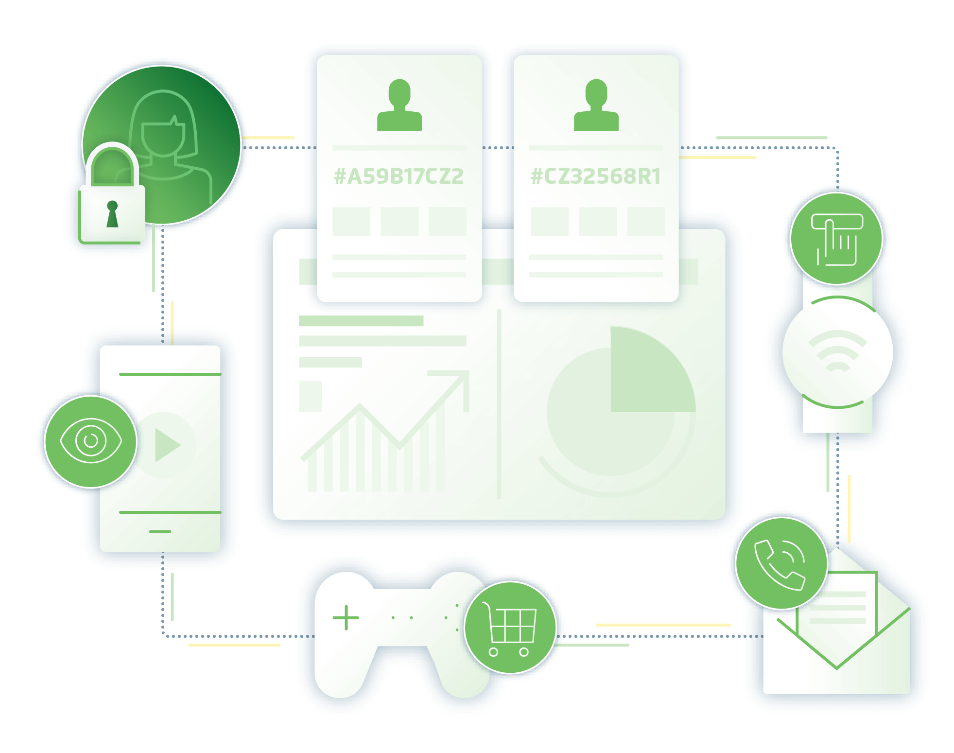
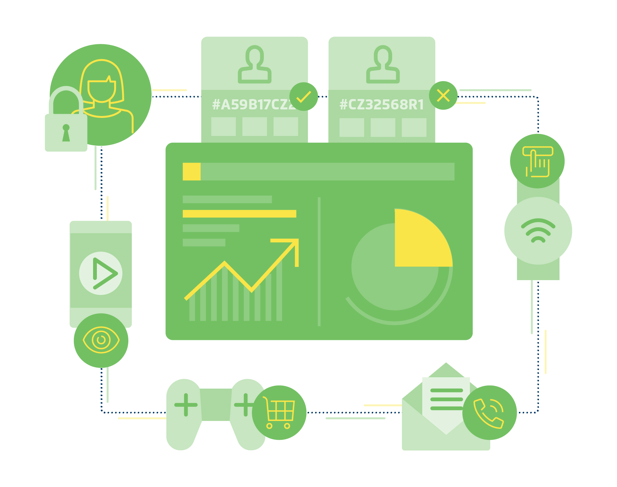

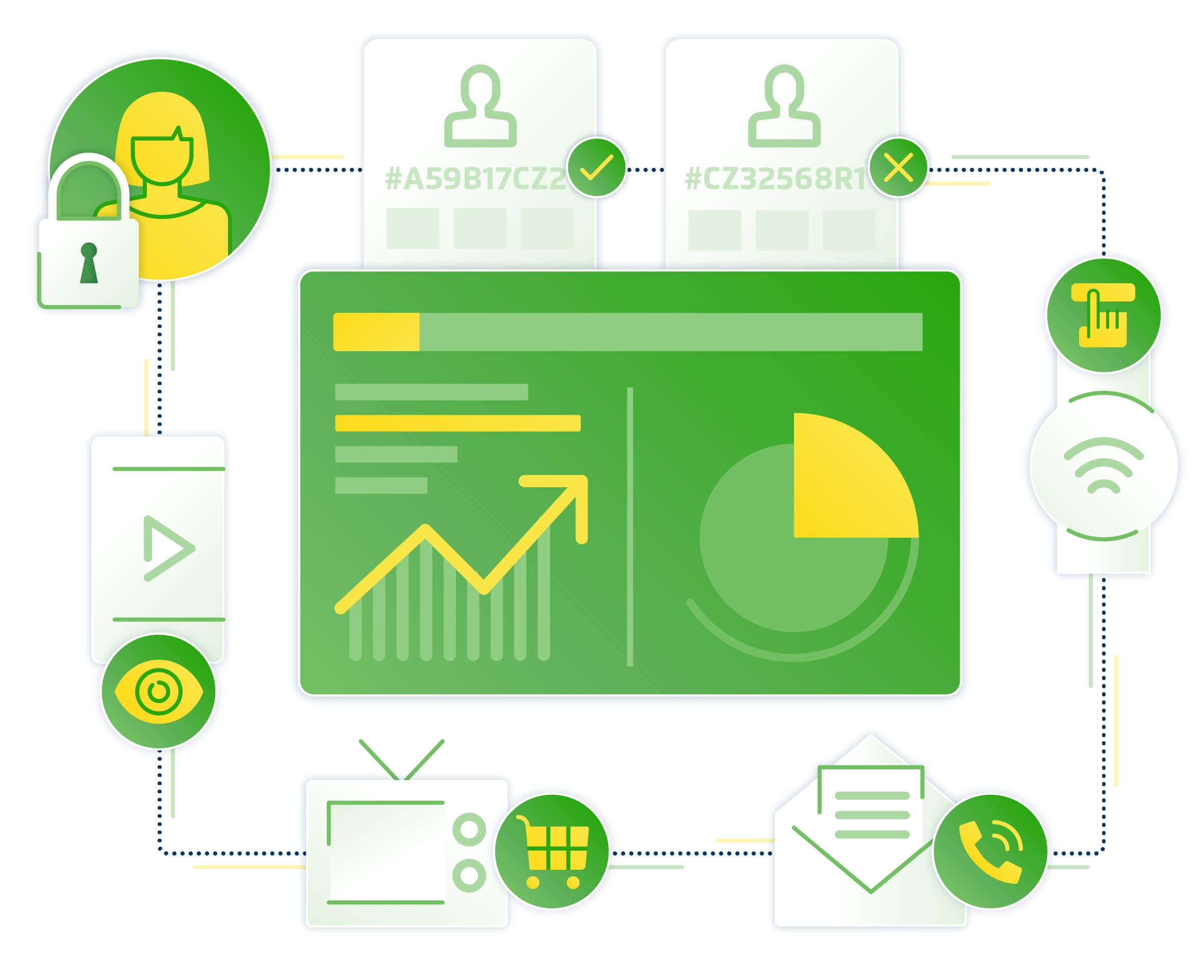
Final illustration solution
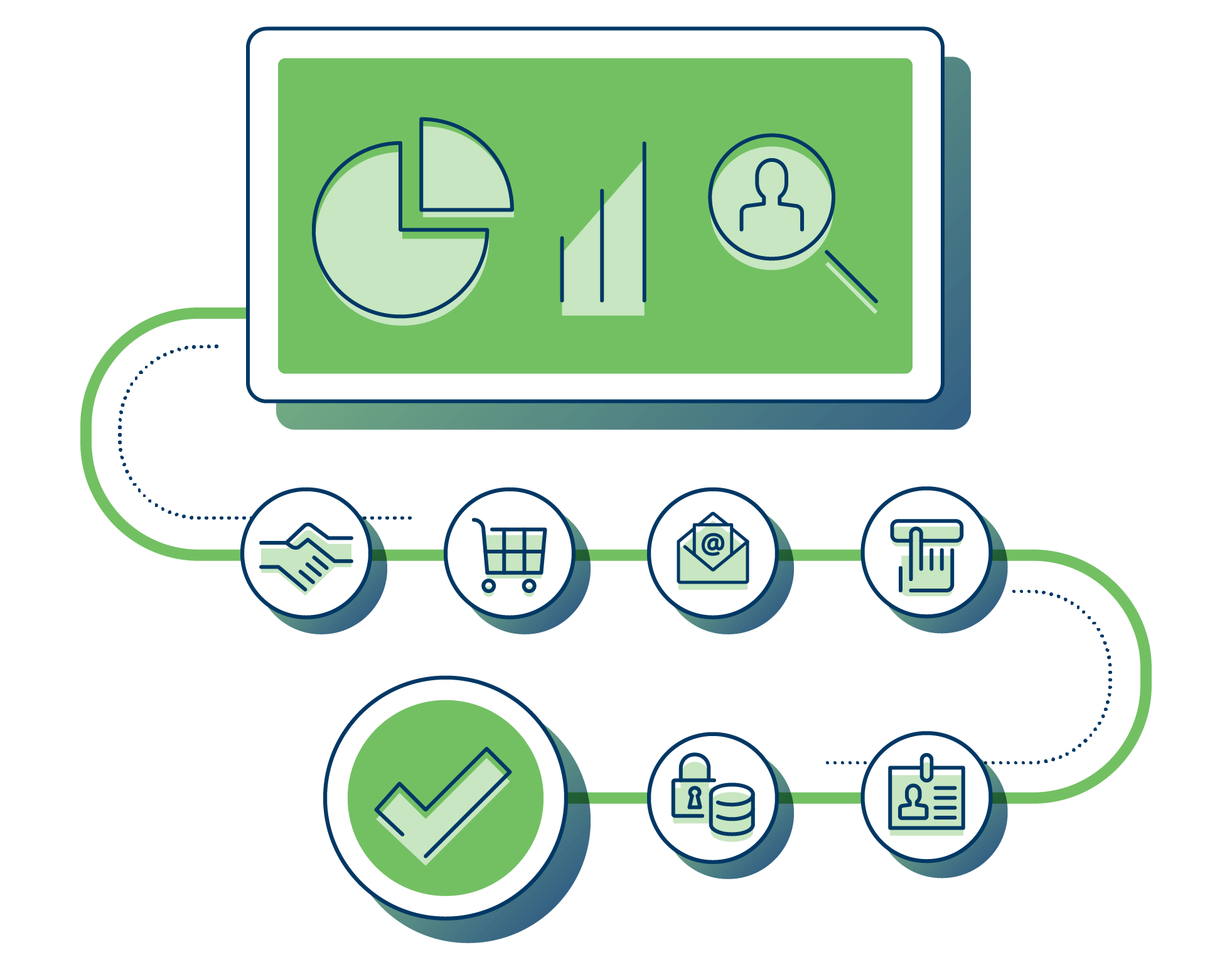
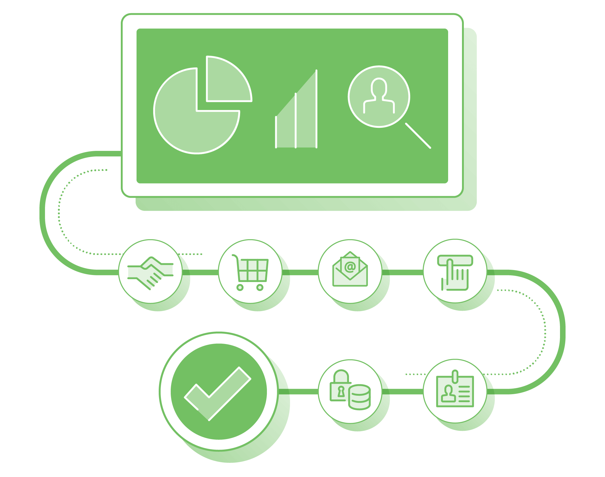
By sticking with the brand palette and core iconography, but updating it with a diagrammatic layout, gradients, and shadows, the final illustration keeps the look and feel of the original brand while elevating it with subtle dimension and clarity.
I love the design of the home page. It’s much cleaner than the previous version, and it does a better job of serving the right content.”
Final home page redesign

