Branded Icon Set
lllustration was a major component of the LiveRamp brand, and the icons were its foundation. Intended to be used alone or combined into compositions, this icon set was used by multiple teams across the organization.
Impact
Following agency branding guidelines, I designed an initial suite of icons to be used across product and marketing. I created a keyline template and instructions for other designers to follow, and directed their designs to ensure they matched the brand. Additionally, I wrote keywords for each icon so they could be easily searched by the wider team.
Establishing guidelines
First, I settled on a grid size. At 192×192 pixels, the set was built at a larger size than a UI-style icon set, but these were intended to be primarily used for marketing illustrations, and would often scale up.
Next, I created keylines so that square, vertical, horizontal, and circle orientations would have the same visual weight.
These icons had an outlined style, so I established rules around stroke weight and corner rounding. An important part of the brand look were the gaps. As an evolution of an earlier brand concept of “connectors,” they created an open, human feel.



Developing keywords
Because the icons were used by the wider team on Google Slides, I devised a keyword system so that they could be easily searched. With 350+ icons total, no one should have to scroll forever to find the concept, product, vertical, or platform they want.
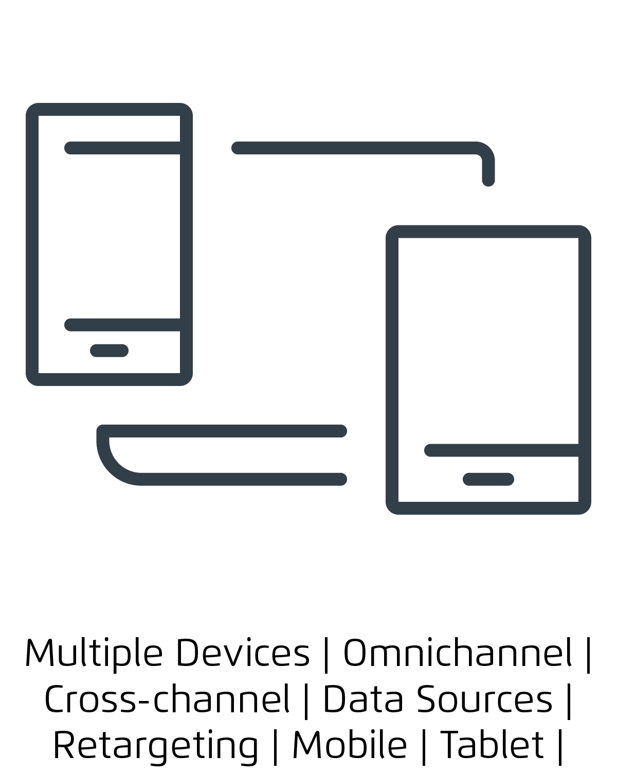

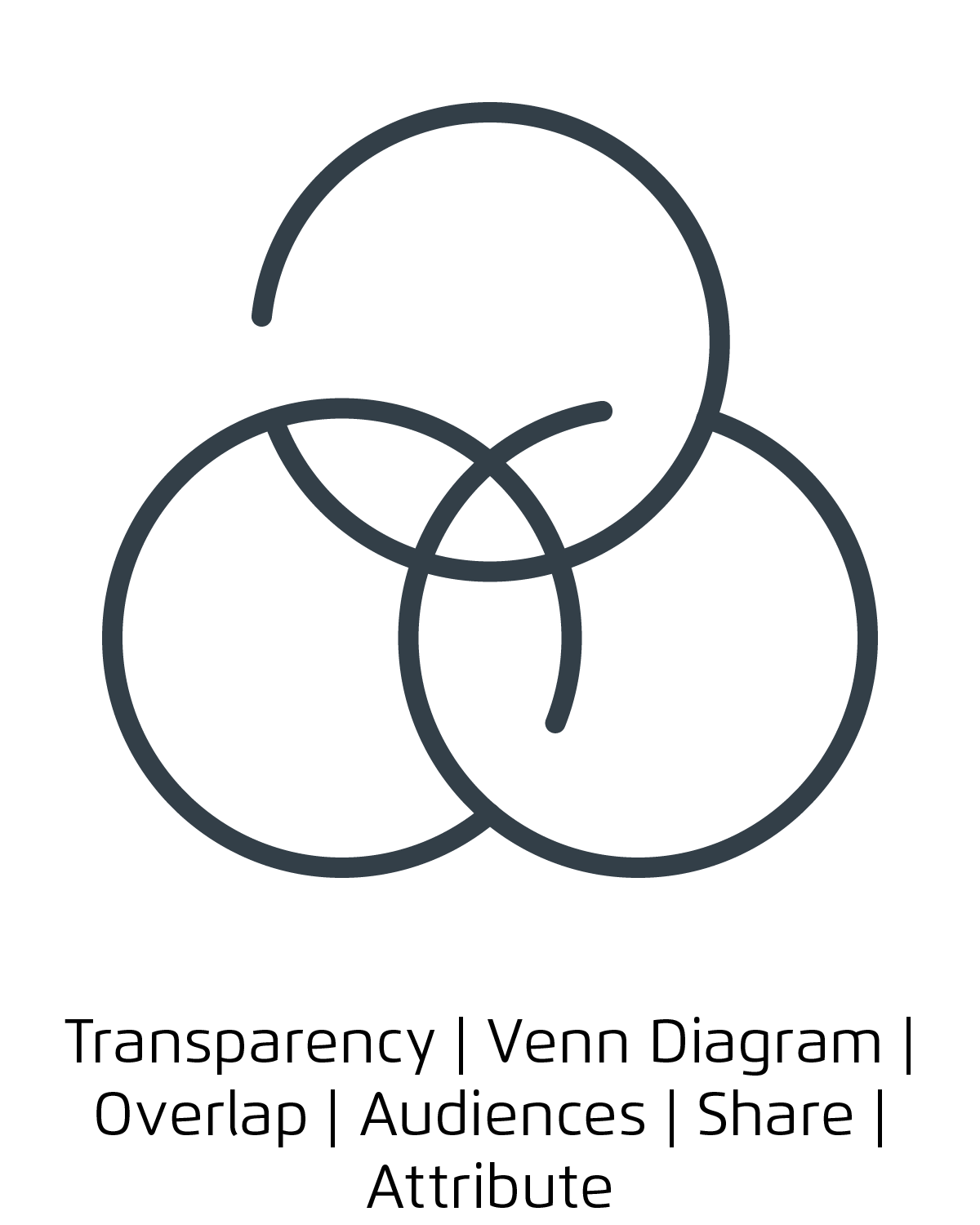
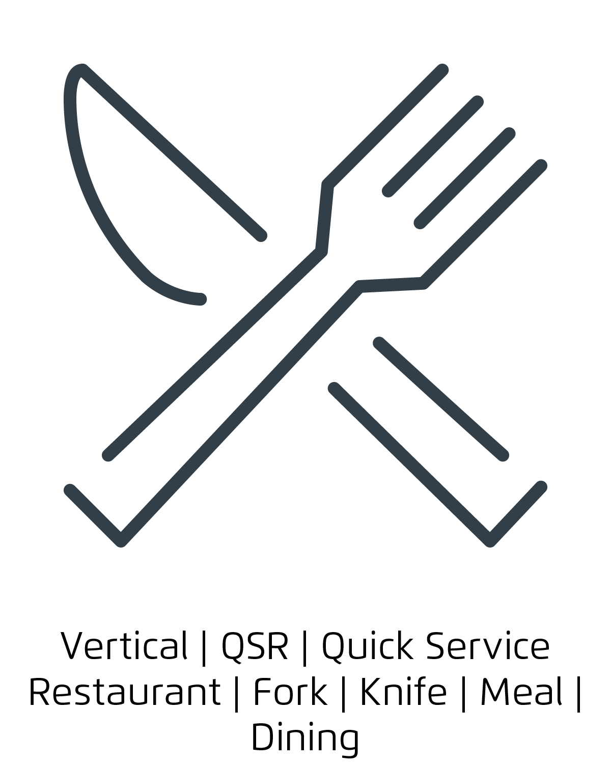
Some icons from the final set


