RampUp Window Design
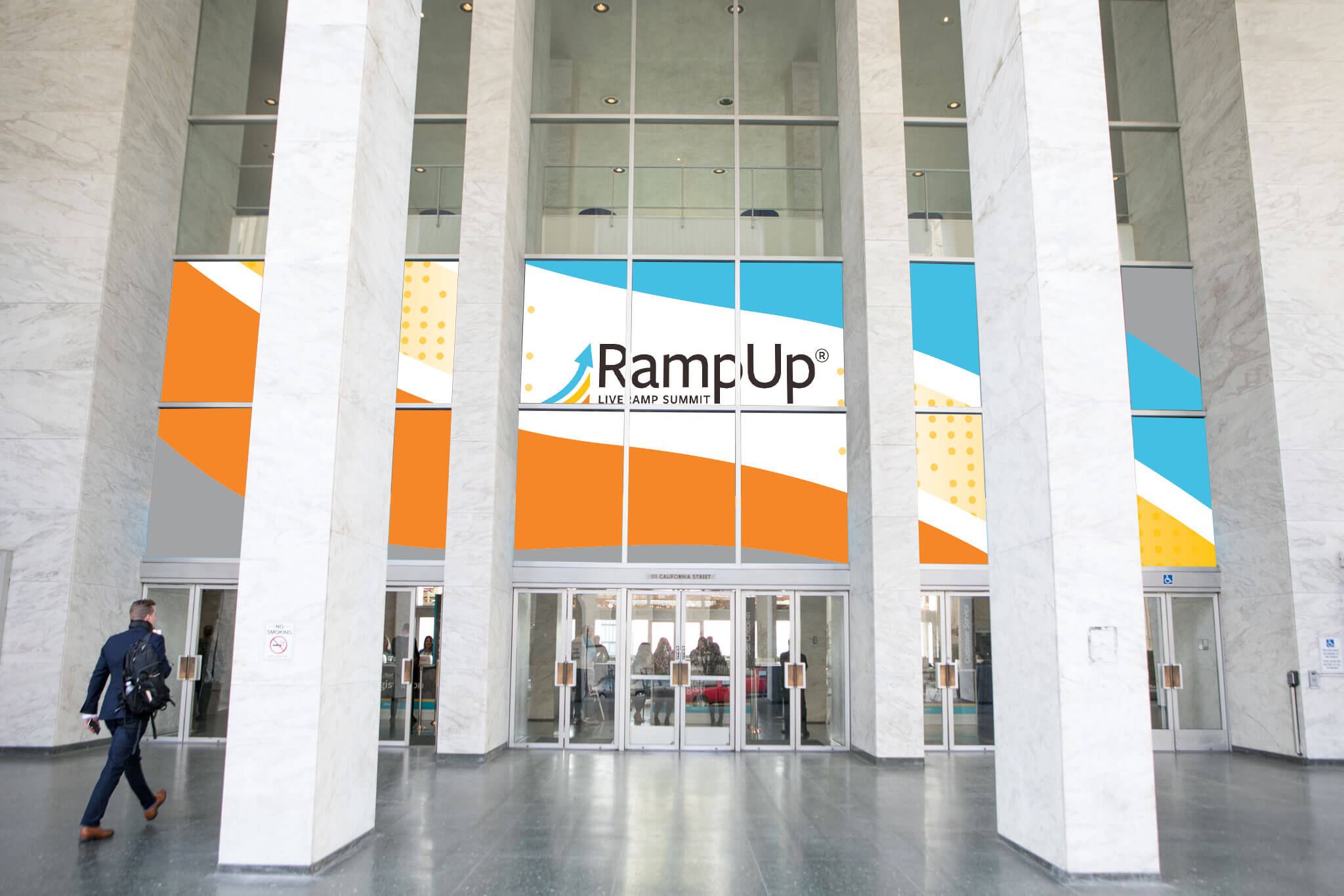
With RampUp’s high-impact keynotes taking place at the historic Masonic Hall in San Francisco, we had an opportunity to create equally high-impact branding on the main entrance windows.
Impact
As design lead I created concepts, worked with stakeholders, and got venue and vendor approval for a uniquely curved design. The end result was a dynamic, energetic statement showcasing both thought leadership and the RampUp brand.
Initial concepts
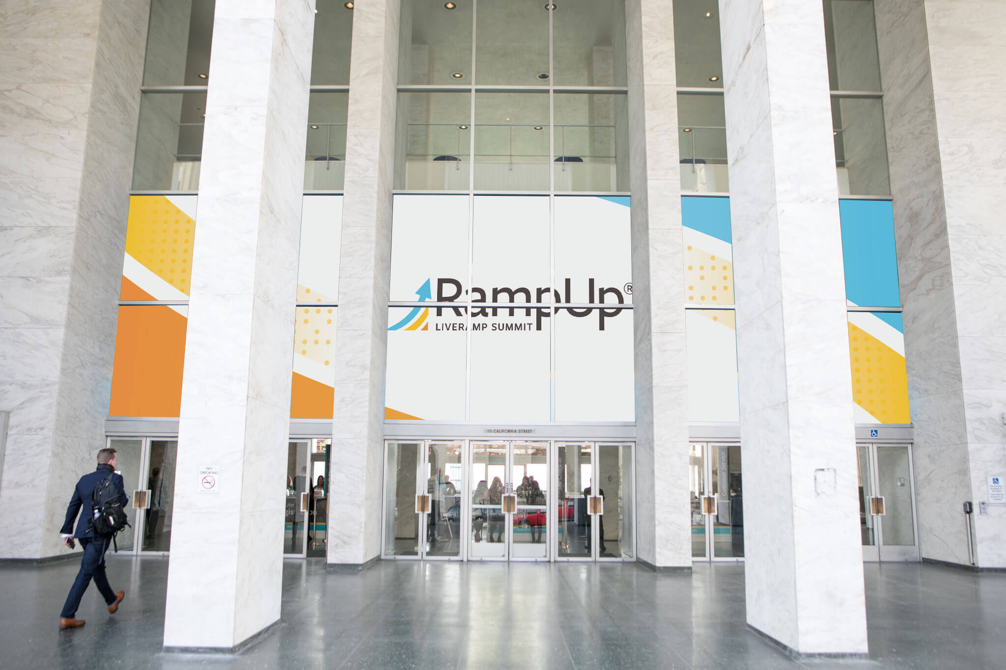
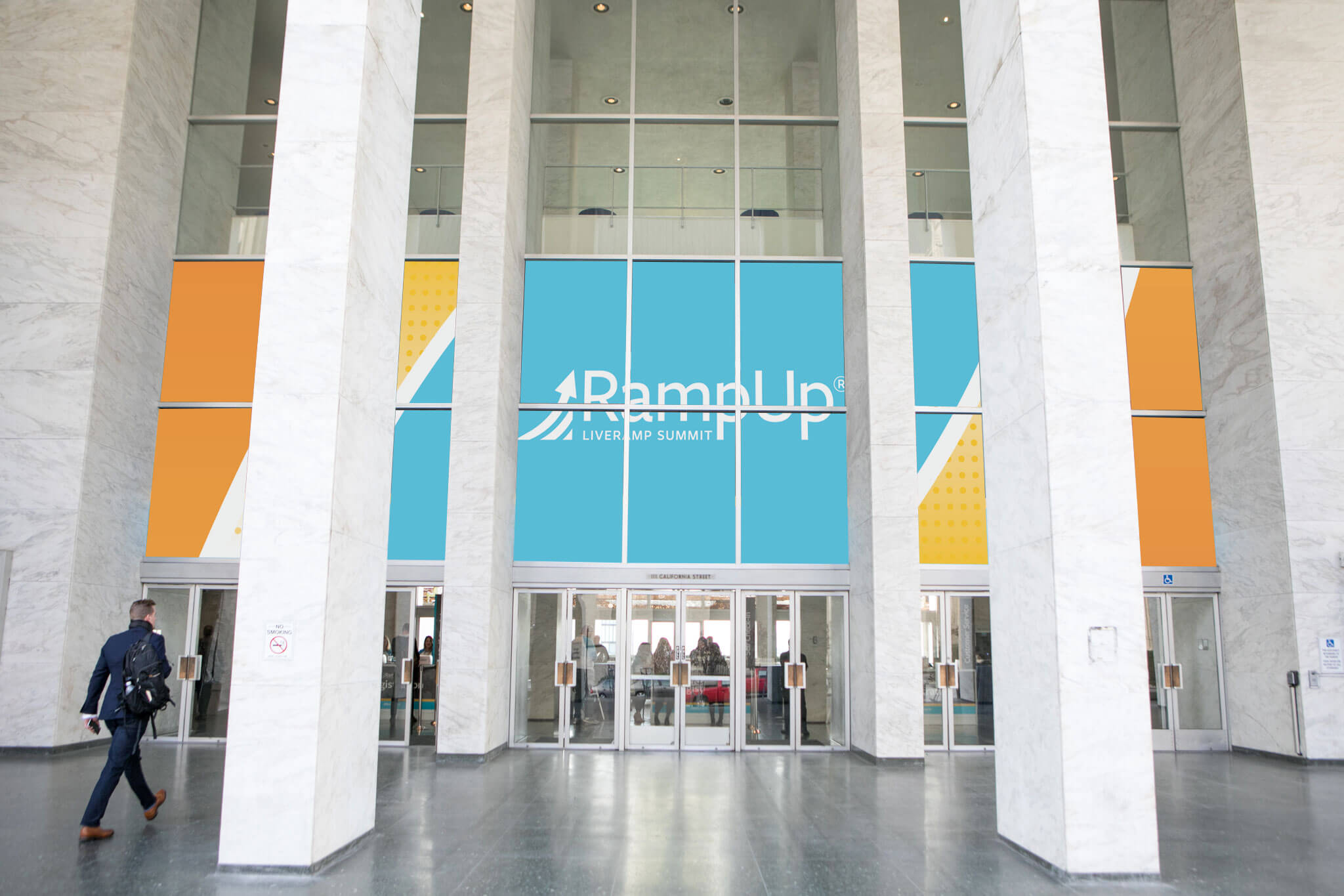
While these technically fit the brand look and feel, they lacked the dynamism of the event. Additionally, because of its centered placement, the brand logo ended up split horizontally as well as vertically. Back to the drawing board.
Final design
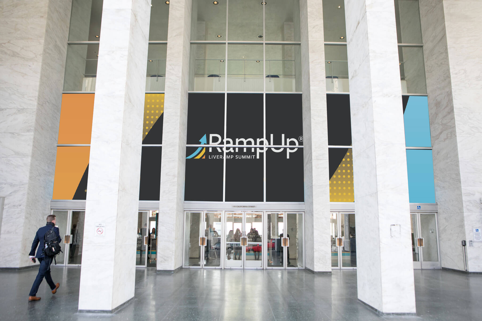
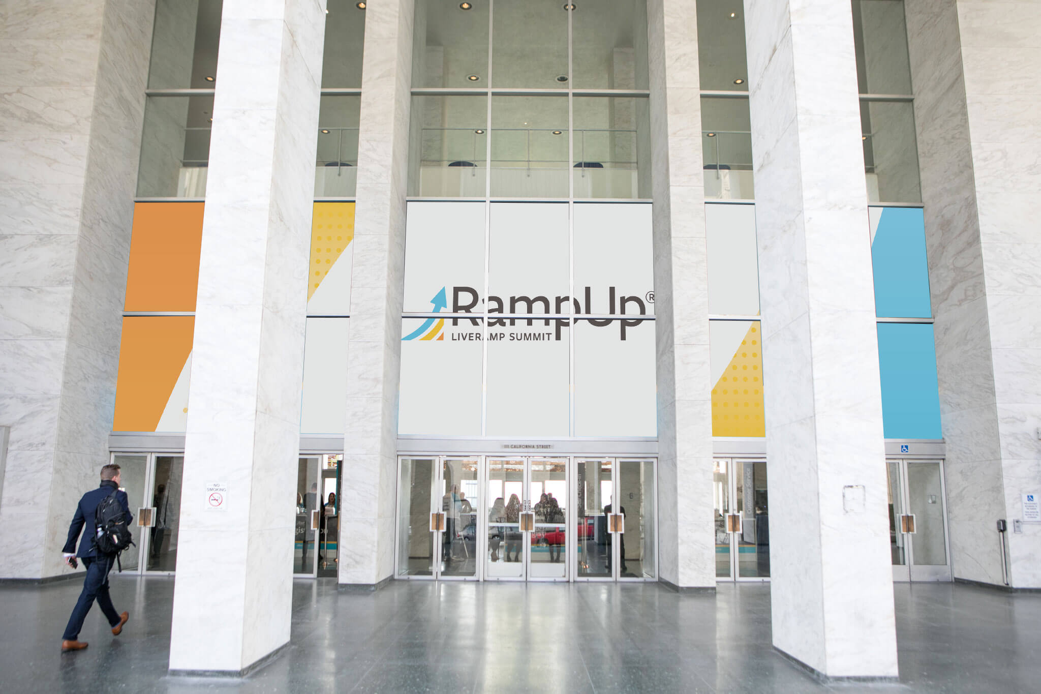
The fluidity of the final design matched the energy of the event, and solved the logo problem by splitting it across just three panels versus six. The gray areas were cut away in production, letting more light come through the windows while adding more visual interest.


