Rebranded Icon Set
While illustration was no longer a primary element of LiveRamp’s rebrand, the icon set was no less important to the visual language. Whether used as UI elements on the product platform or in slide decks by sales and marketing teams, the icons embodied a sophisticated SaaS look and feel.
Impact
Following new agency branding guidelines, I redesigned a core suite of icons to be used across product and marketing. I created a keyline template, gridlines, keywords, and detailed instructions for other designers to follow.
Establishing guidelines
At just 28×28 pixels (or less!), the rebranded icon set was built specifically for user interfaces and as a compliment to slide decks. I aligned each icon to a grid, and built out keyline shapes so that square, vertical, horizontal, and circle orientations could maintain the same visual weight.
Where the old icon set was playful, rounded, and open, the new set was mature, squared off, and deliberate. Their weight in combination with their relatively small size necessitated a minimalist approach, and so the challenge was to create each icon using the fewest lines and shapes possible. This also meant finding abstracted ways to depict complex concepts.
Since these icons were filled instead of stroked, the corner treatment became an important brand signifier: sharper outer corners juxtaposed with rounded inner corners. A general rule of thumb was to keep a minimum of two pixels between all shapes for readability.




A study in edge cases
As with all rules, the ones I created for these icons were meant to be broken—or at least bent a little.
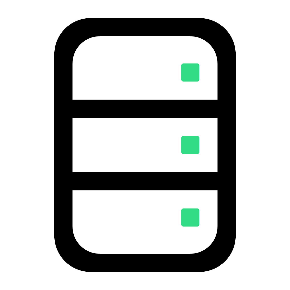
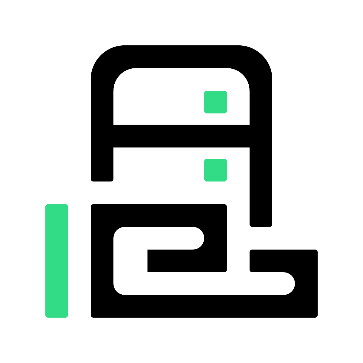
When designing the data server icon, I started with a rectangular shape to align with brand guidelines, but the squared corners suggested a filing cabinet instead. I ultimately rounded the corners considerably so the icon would be recognizable as a data server.
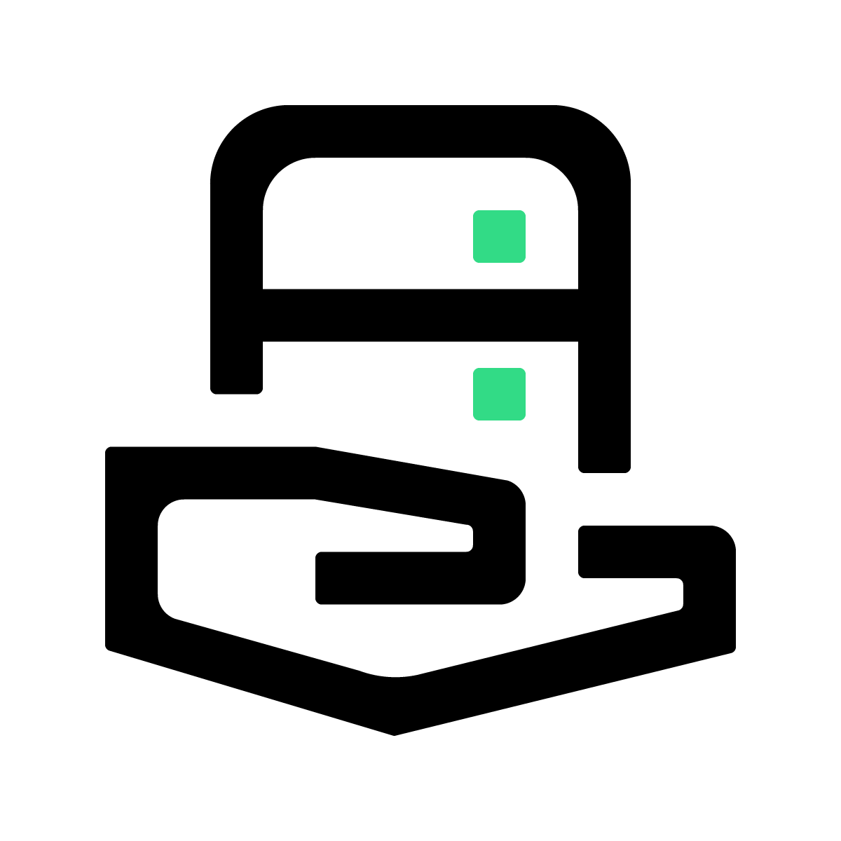
Similarly, when designing the data provider icon, I created the hand as a simple, linear, squared-off shape. The only problem was that the end result didn’t look like a hand. Even though curving the hand shape didn’t “match” the brand, exceptions must be made for the sake of legibility.
BEFORE

AFTER

BEFORE
AFTER
Improving icon search and organization
While I’d already written keywords for the old icon set, there’s always opportunity for process improvement.
I identified seven core thematic buckets to organize the new icons into: Verticals & Platforms, Users & Data, Media & Devices, Products, Concepts, UI, and Logos. Each icon was then named with a thematic keyword in addition to a unique keyword for easier searching. Lastly, I rewrote the icon keywords to reflect updated industry and product naming conventions.



Some icons from the final set


