Rebranded Renaissance Ebook
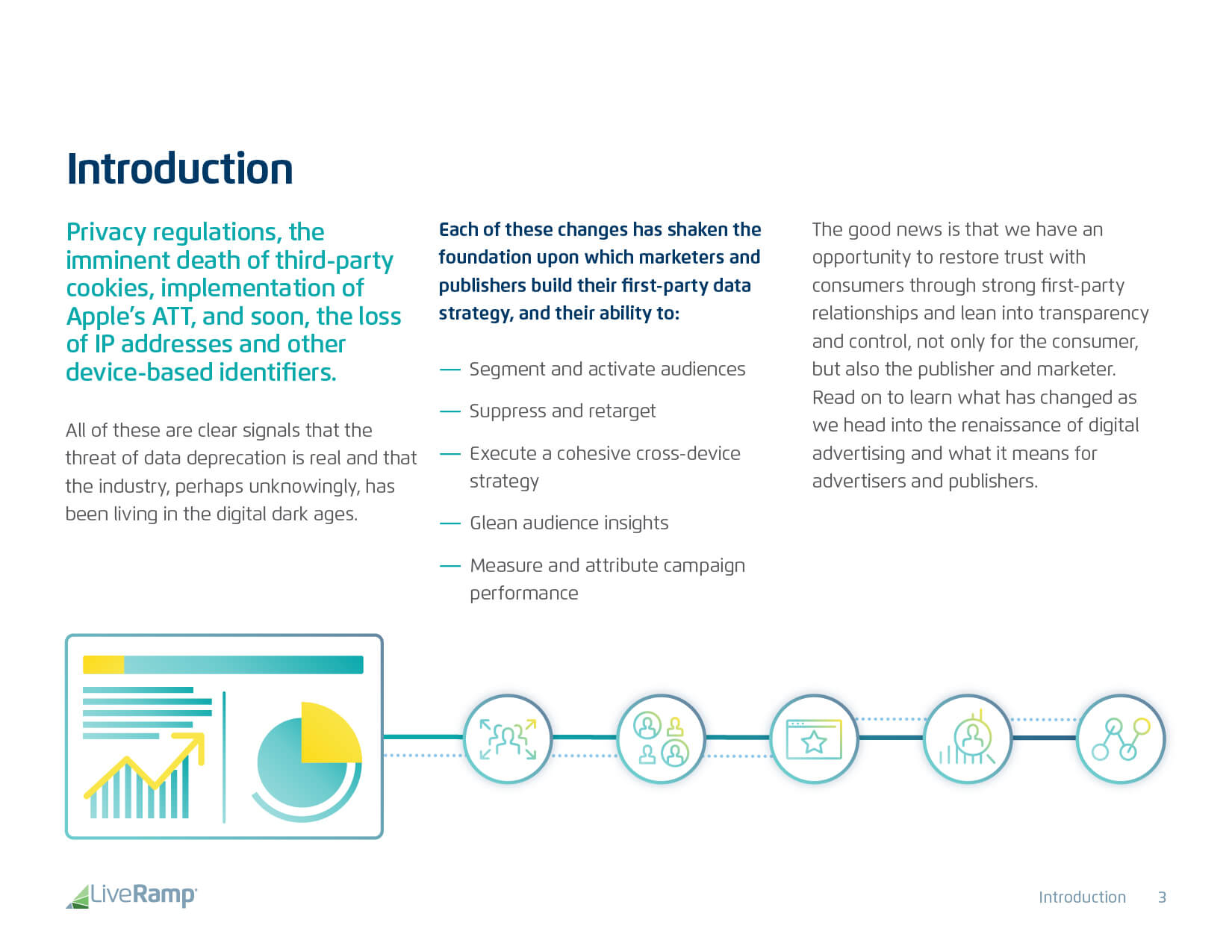
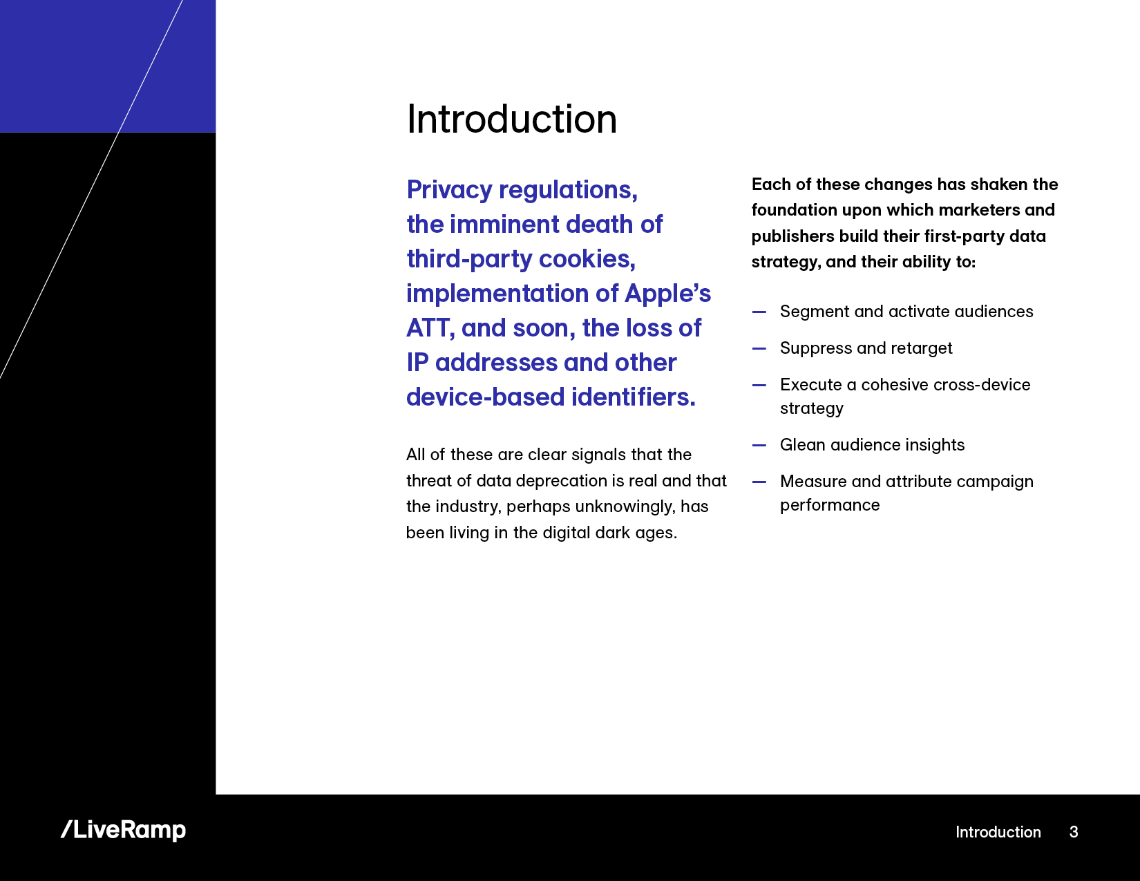
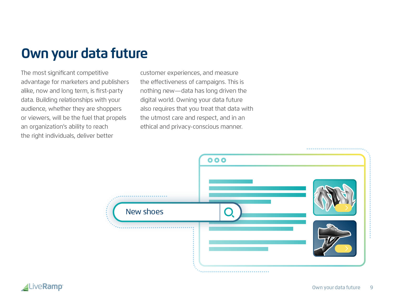
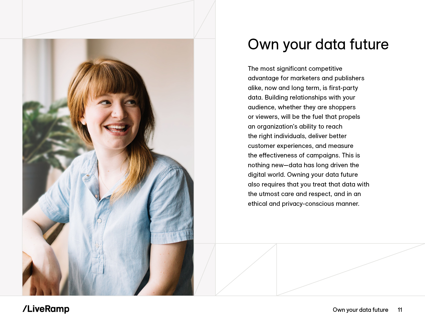
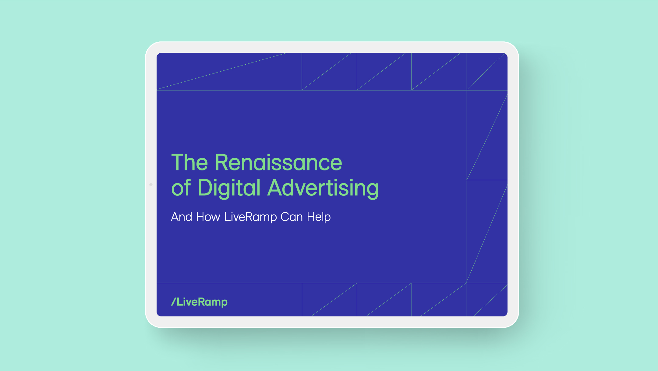
LiveRamp’s rebrand was a total stop-change-start in terms of style, and one of the first challenges was to devise a system for translating existing long-form content into the new look and feel.
Impact
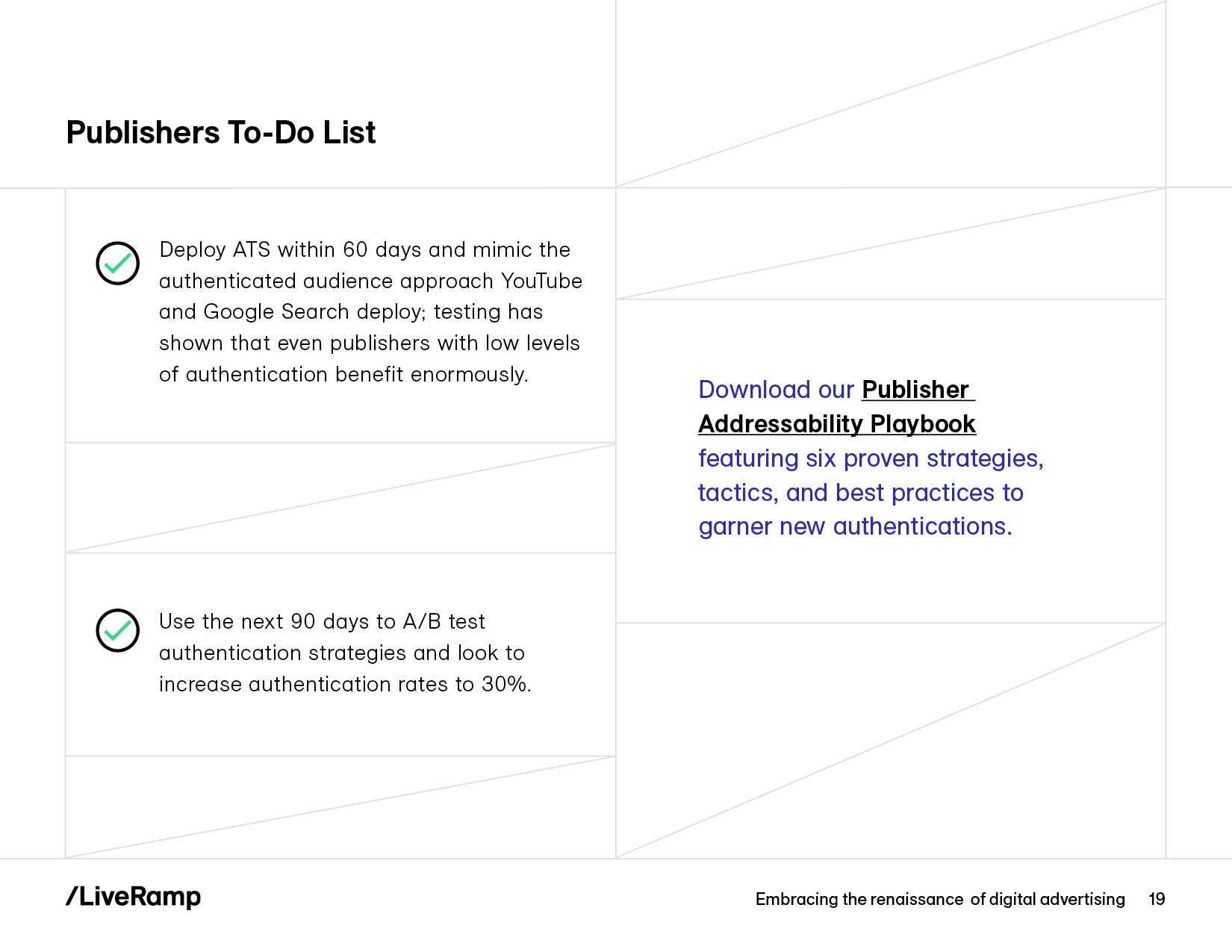
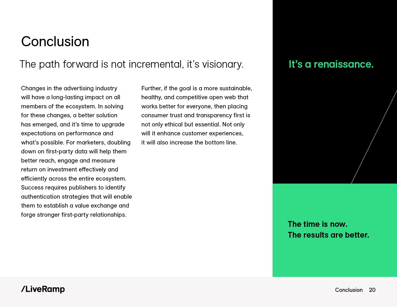
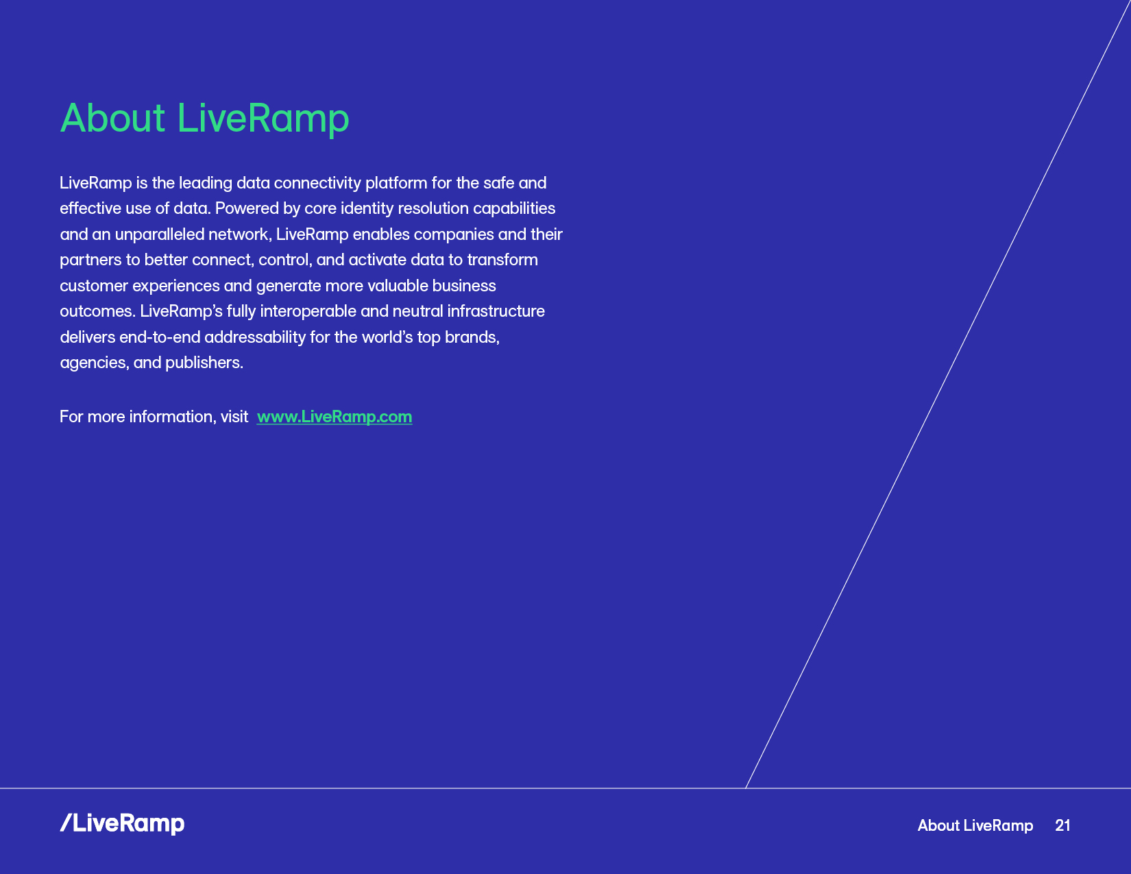
As lead designer, I took the new guidelines and graphic elements from the branding agency and put them to work, developing a methodology for content layout, type styles, and photography treatment.
Developing the new visual language
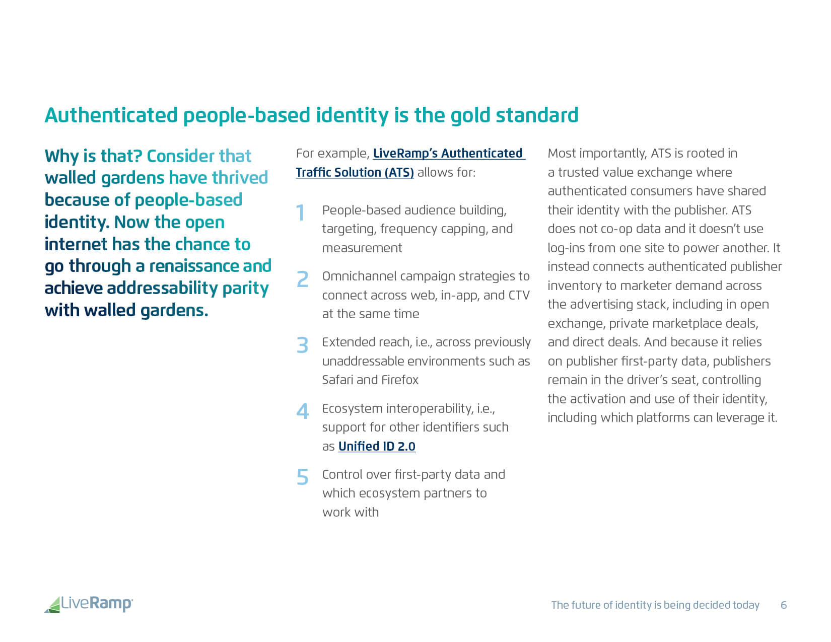
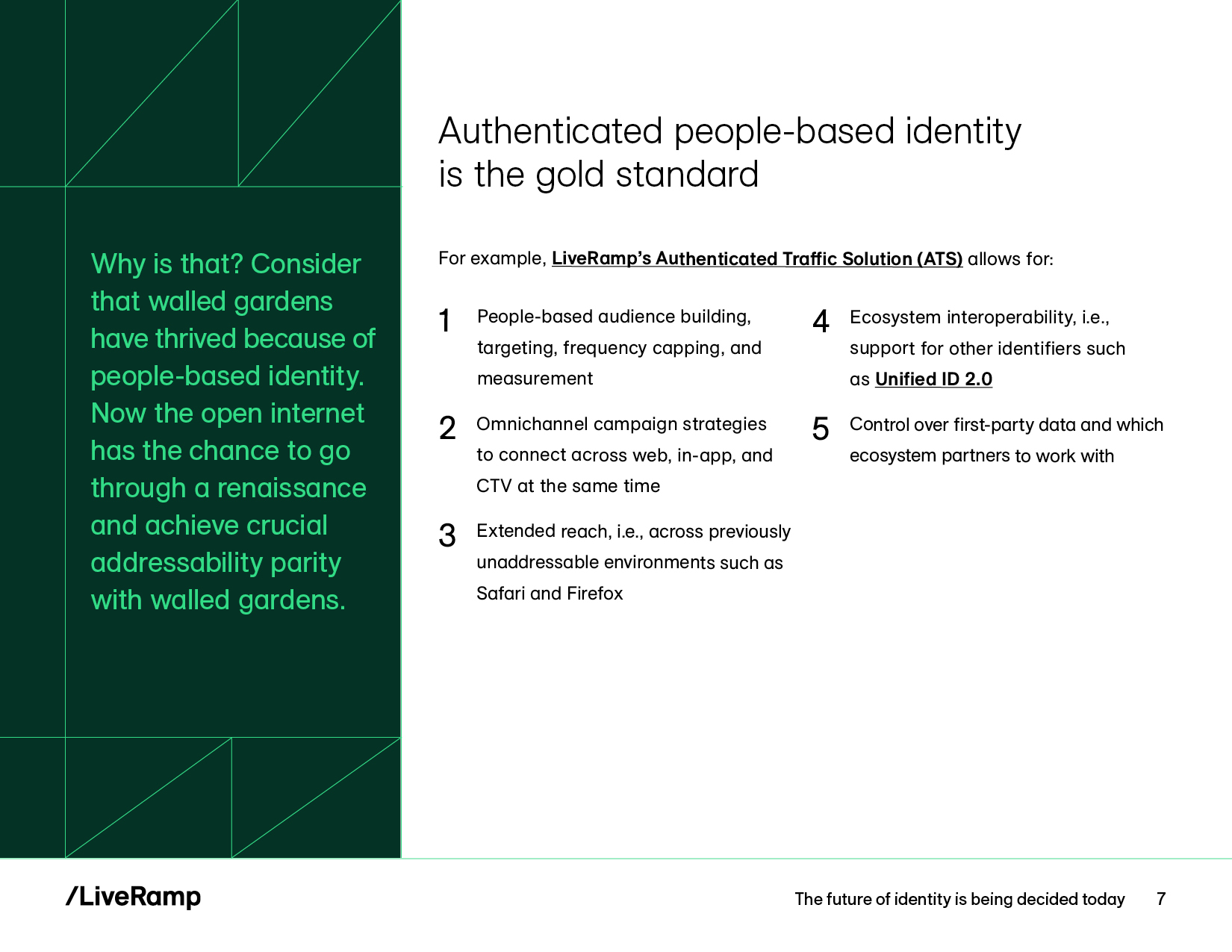
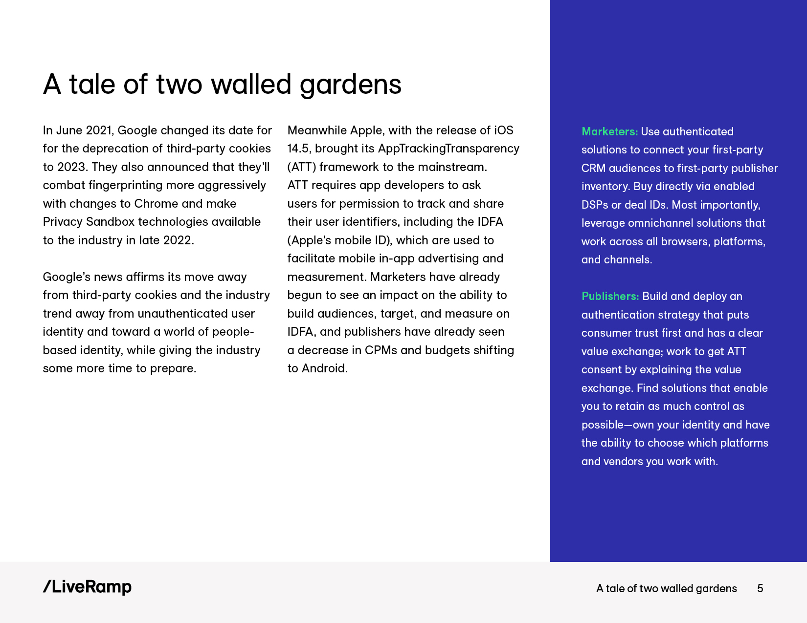
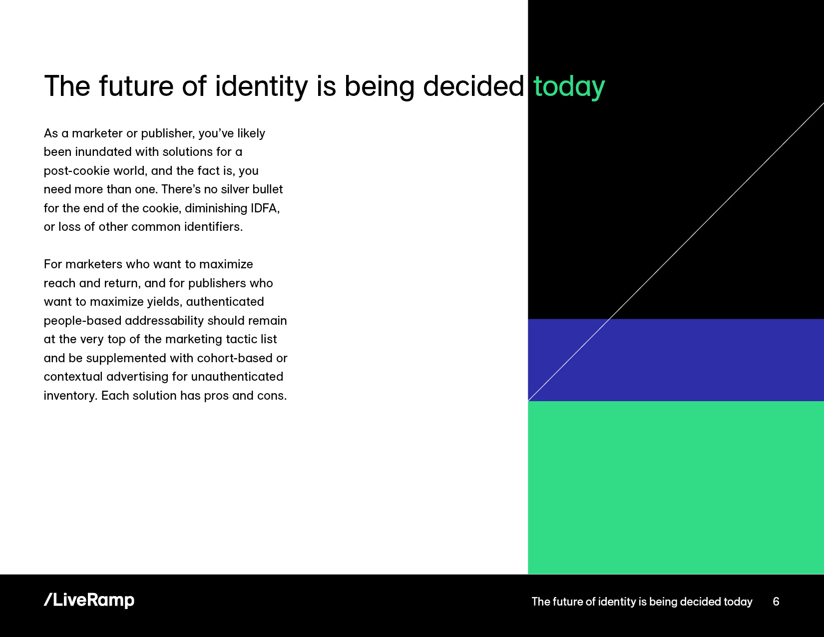
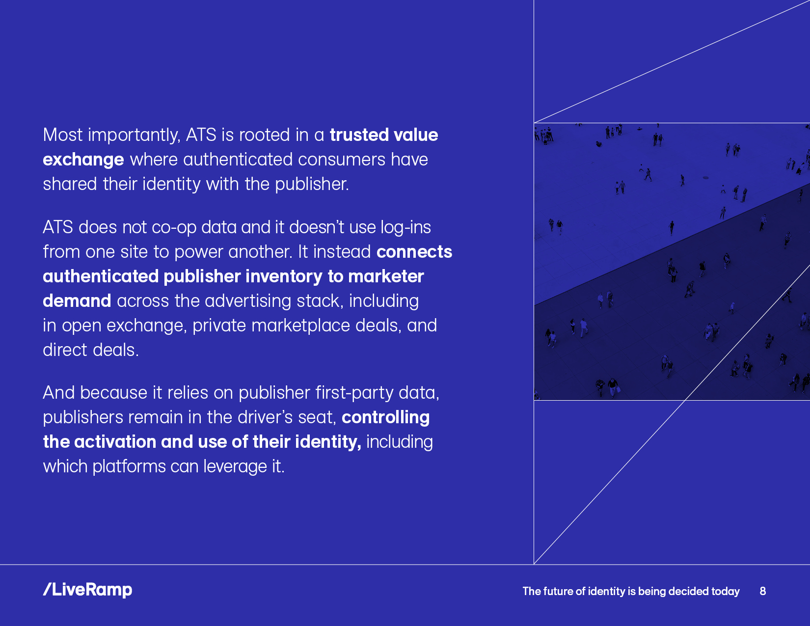
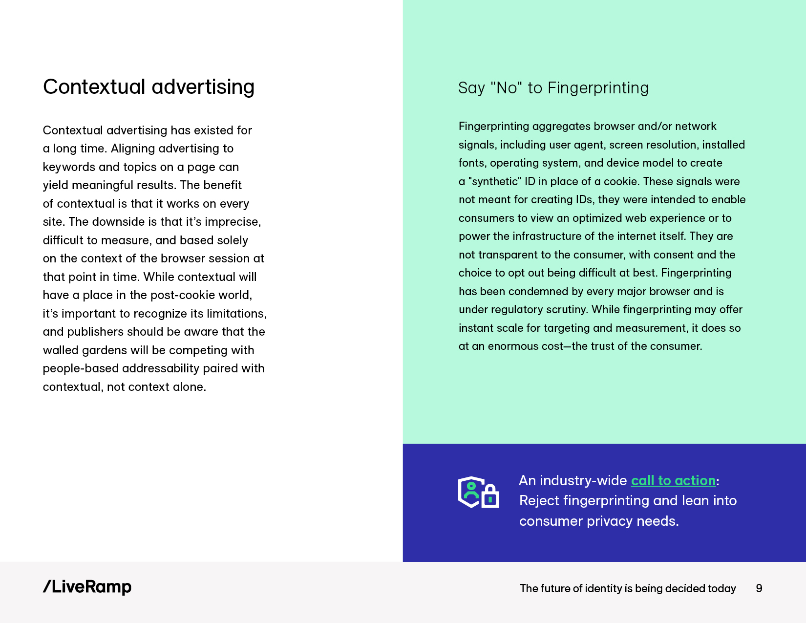
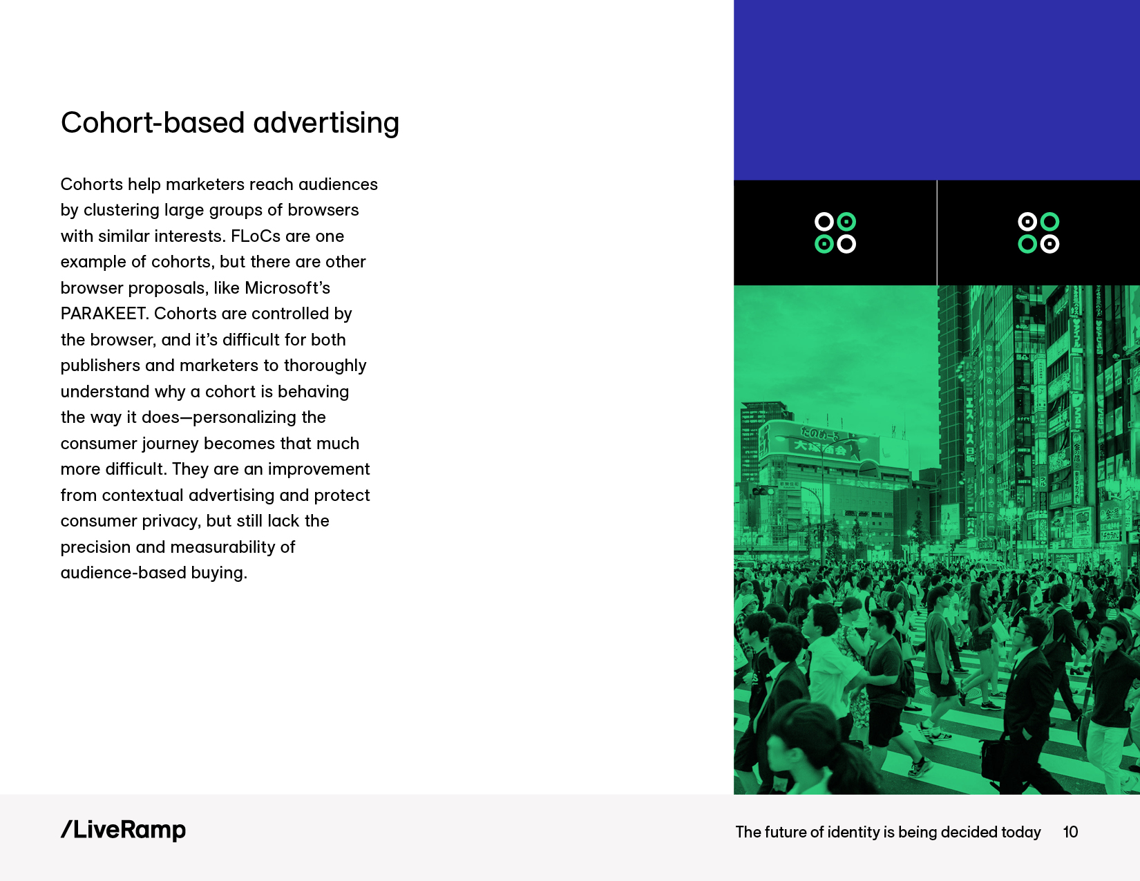
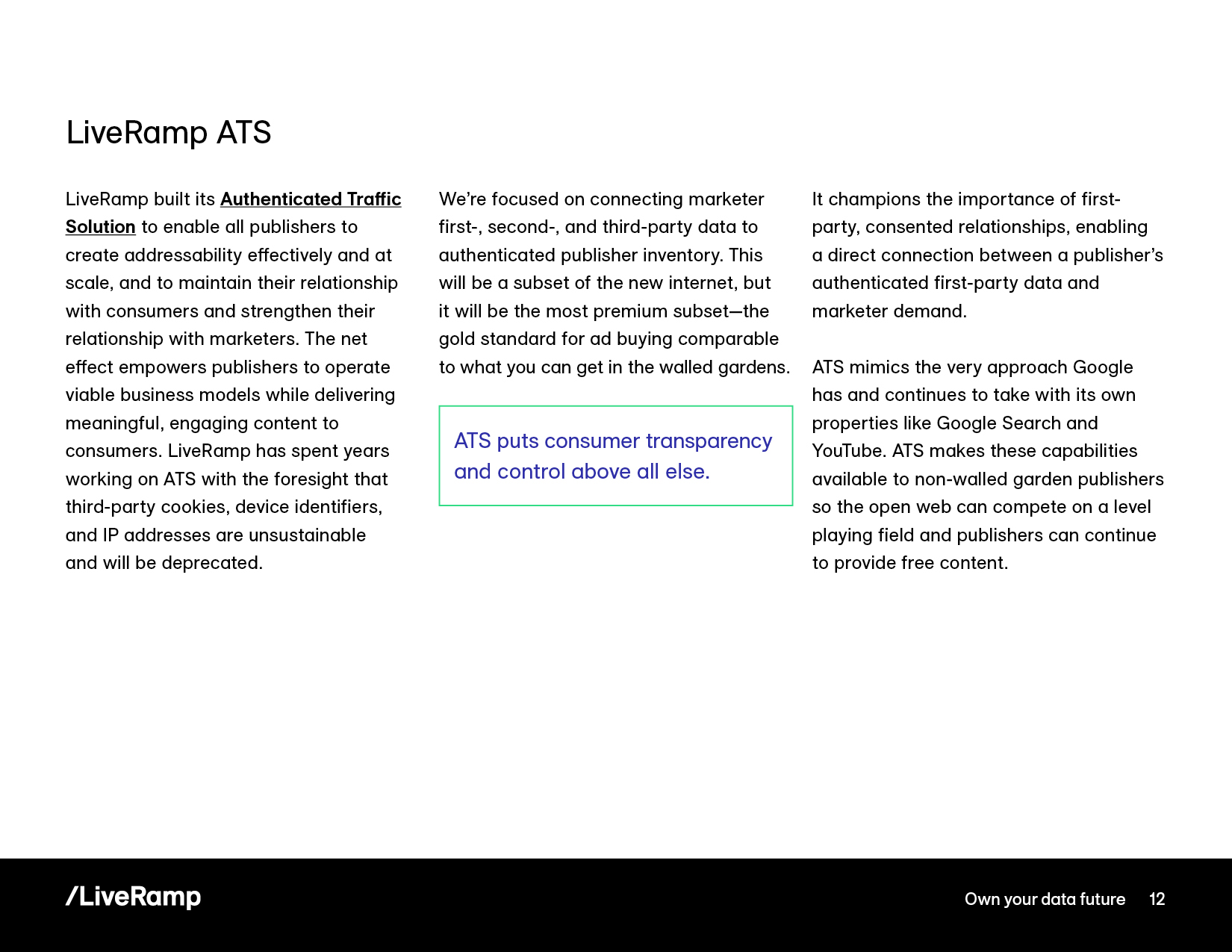
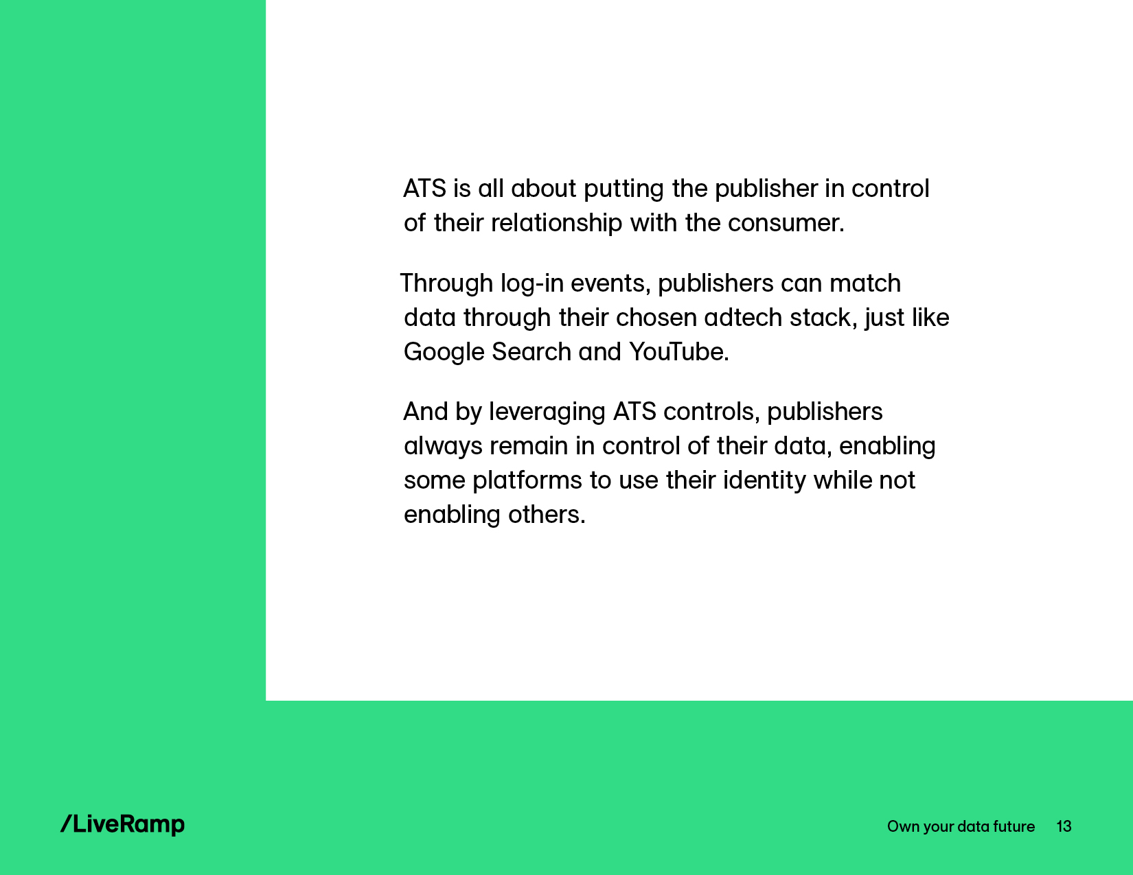
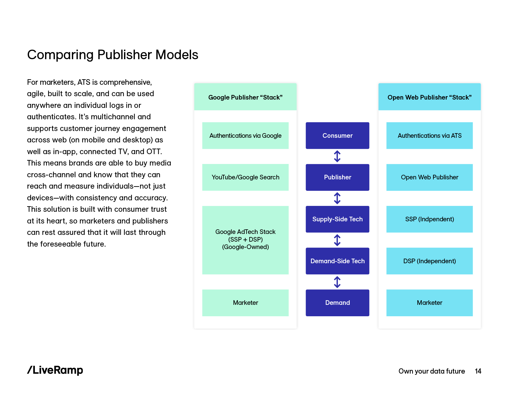
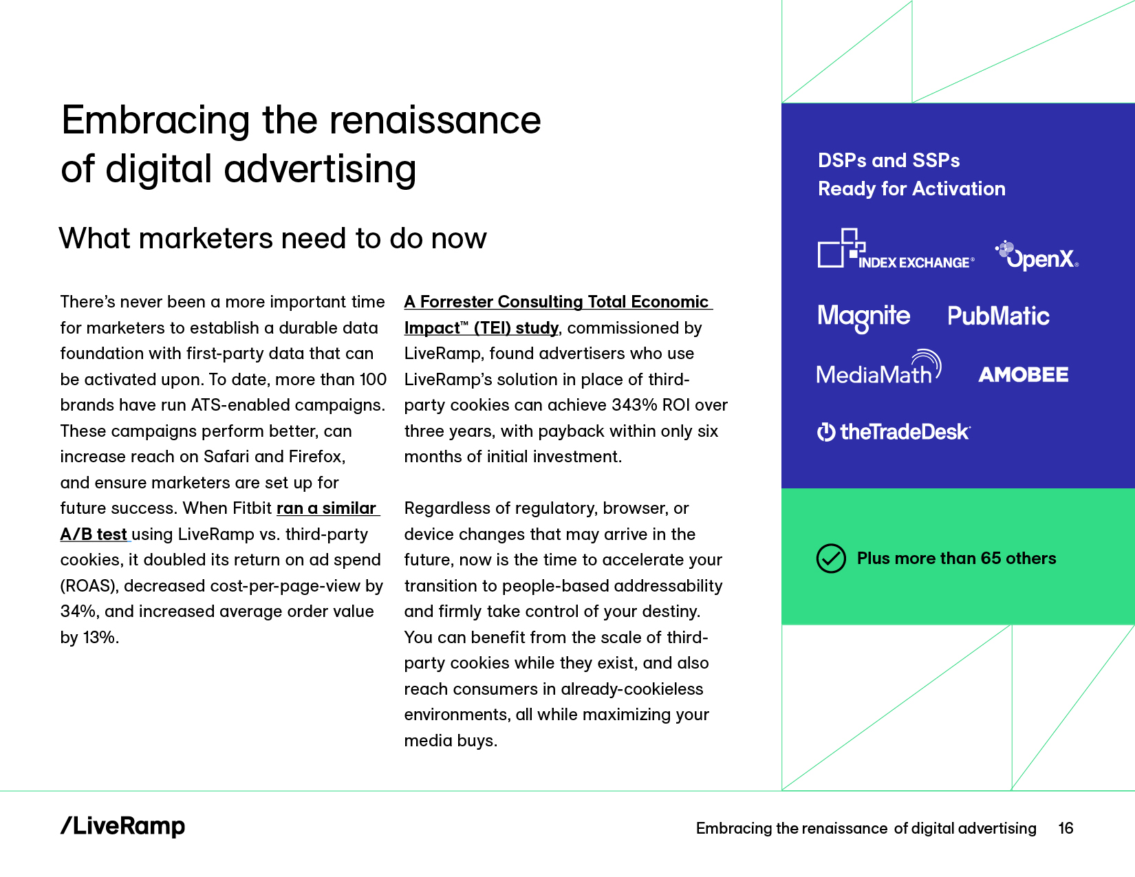
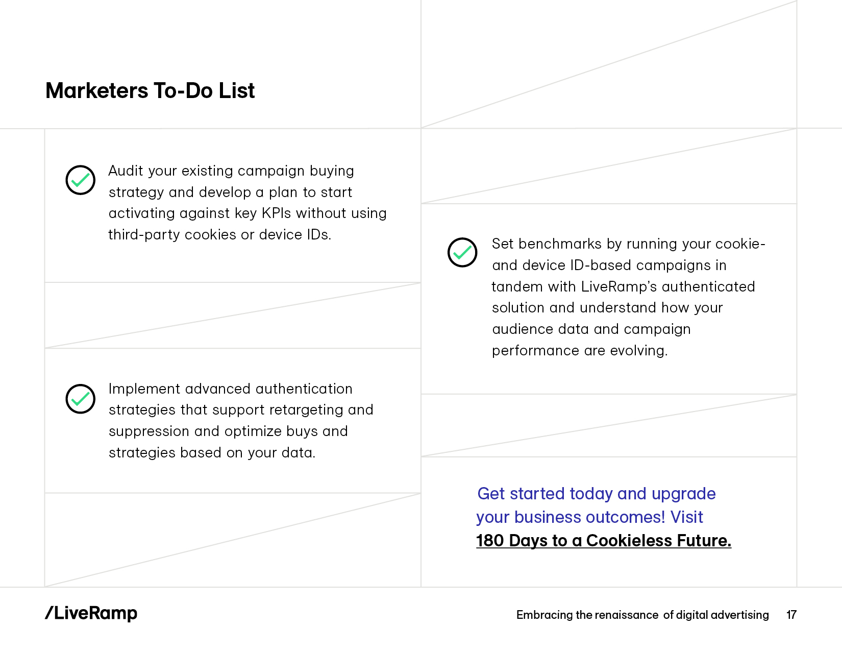
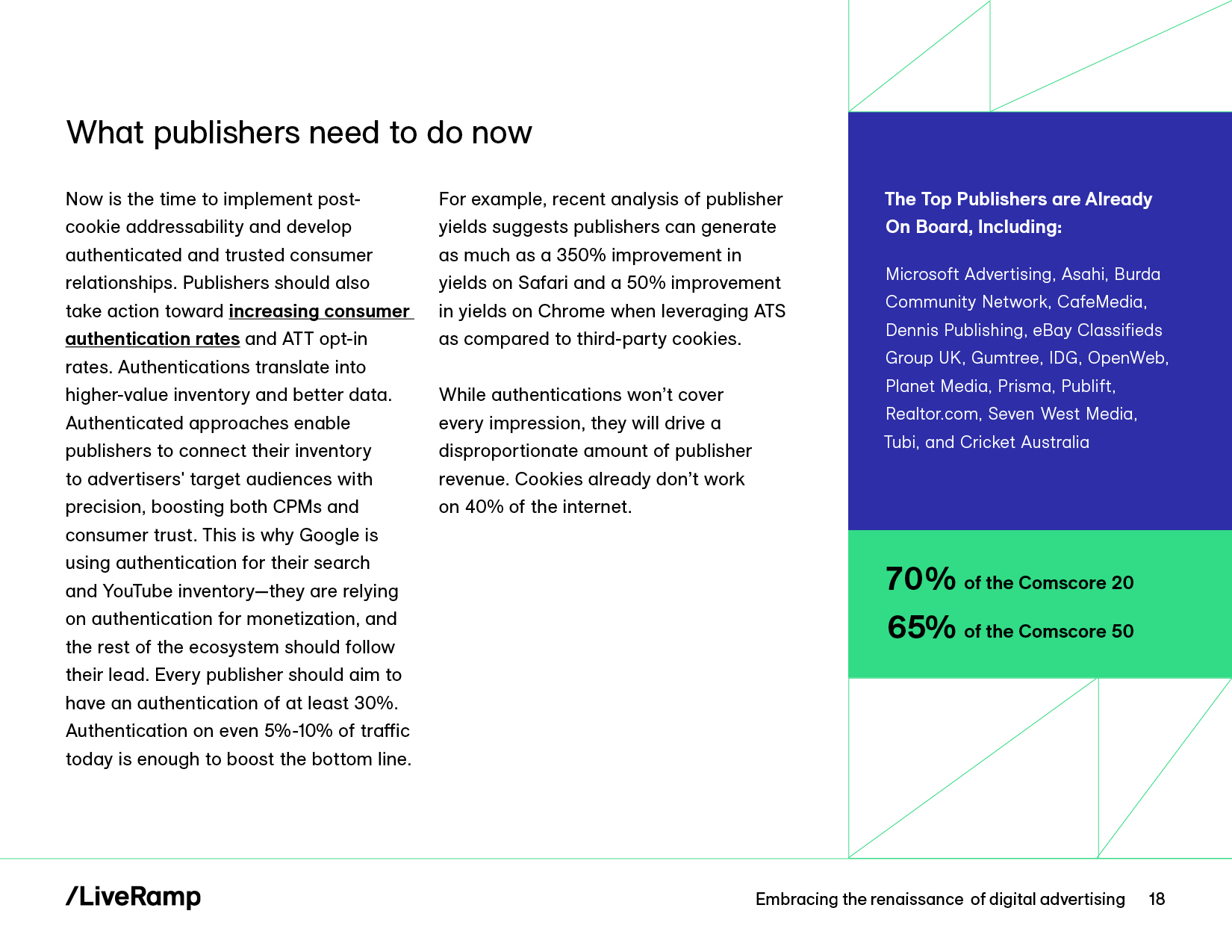
While LiveRamp’s old brand was centered on illustration, the primary graphic elements of the new brand were grid lines, color blocking, and typography—all with an overarching emphasis on simplicity.
Since we could no longer illustrate the page content, the challenge became how to use the new graphic elements to reinforce the content more abstractly. On the Introduction page below, for example, the color blocked border with the slashed line subtly supports the narrative about shaken foundations, while the white space around the text block echos that tension.
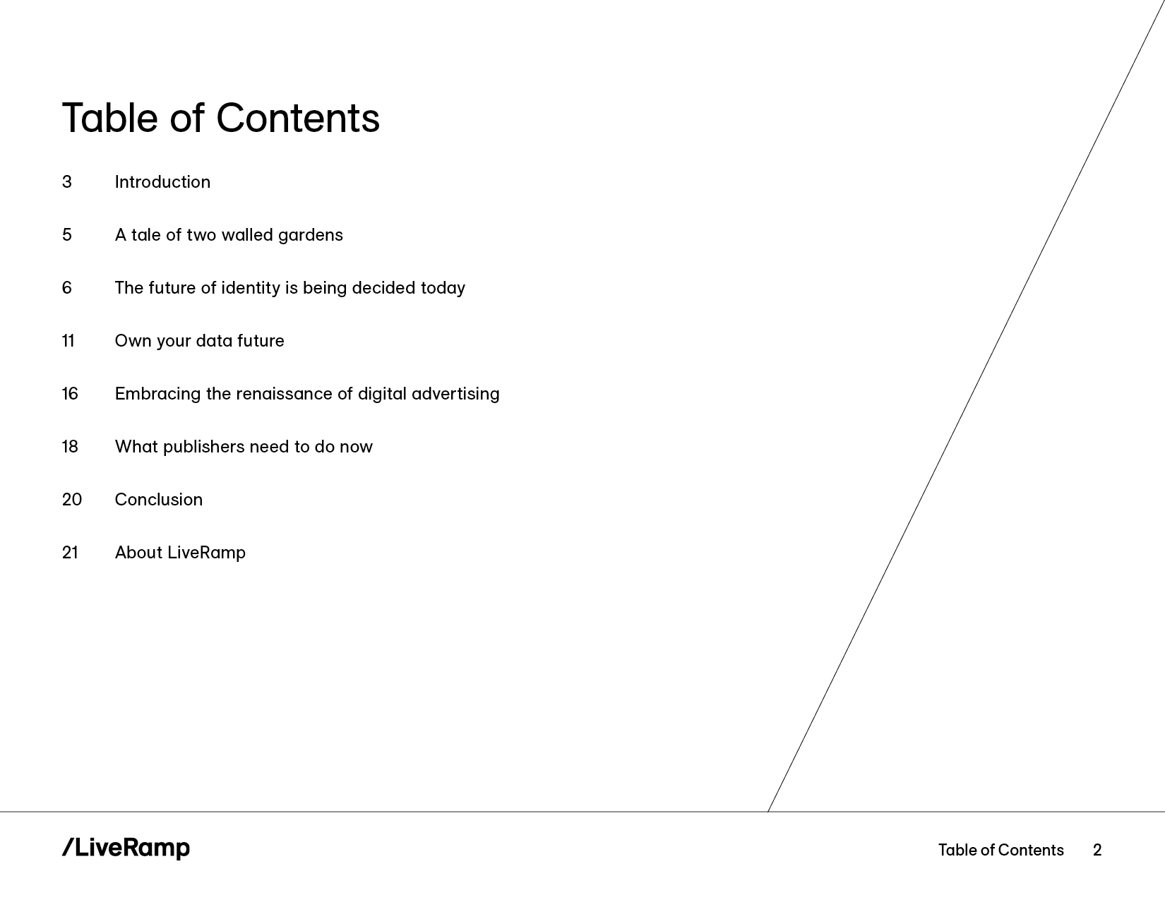
Reducing the amount of text on most pages gave the eye a place to rest and made for easier reading in the new style. Pulling in the grid in key areas provided a natural framework for the content. And using fewer colors on each page helped to keep them simple. The final result was a more mature, sophisticated, enterprise-level version of the ebook.
BEFORE
AFTER
BEFORE
AFTER
BEFORE
AFTER
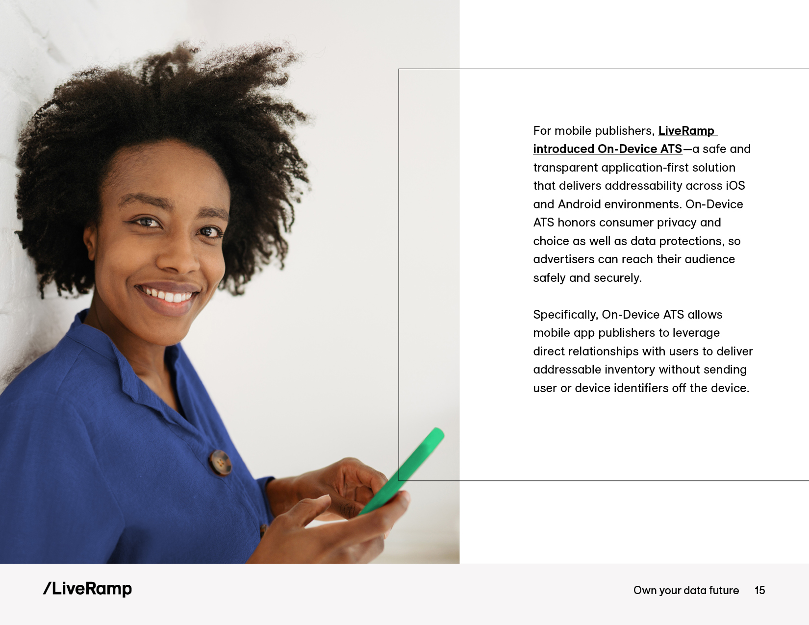
Photography treatment
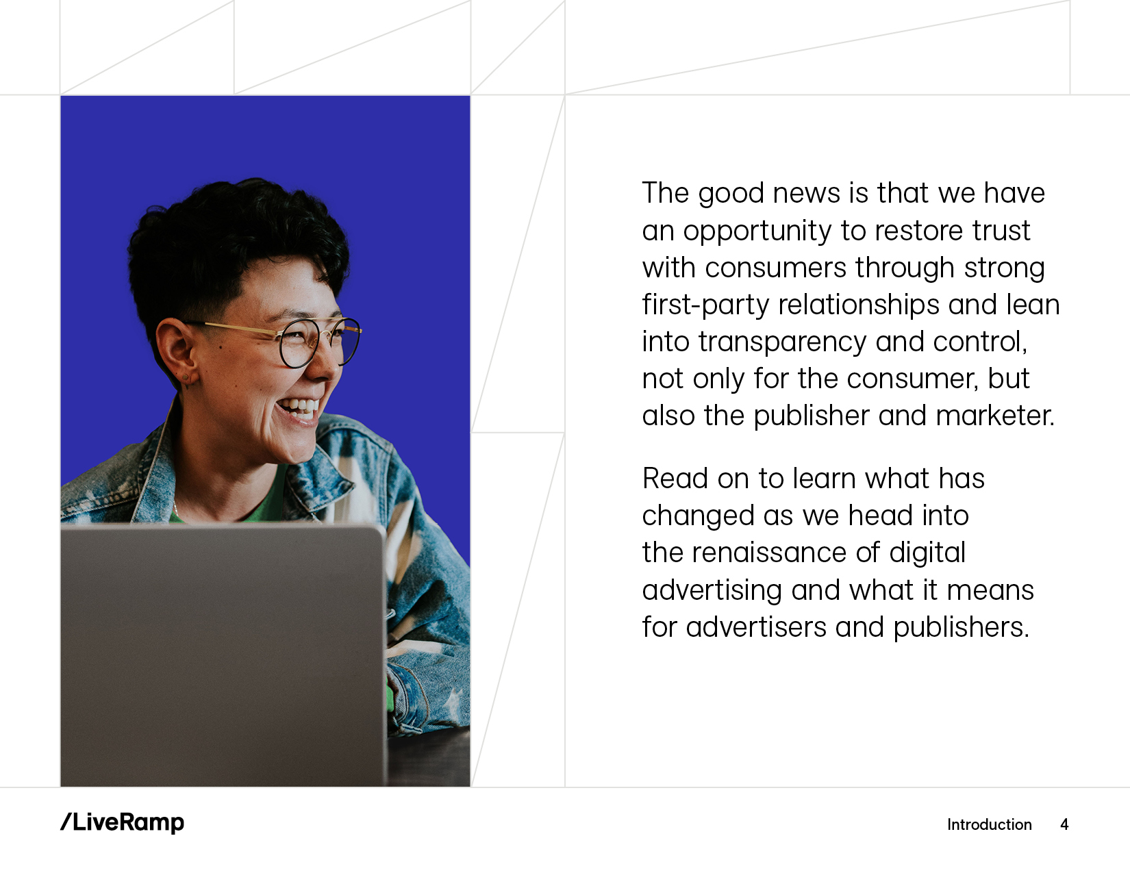
Natural poses and settings, warm tones, and shallow depth of field were core components of the new brand’s photography style. But in lieu of a bespoke brand photo shoot, I opted to develop a custom treatment for stock imagery.
In the example below, I decluttered the scene, reduced the overall red tone, replaced the heavy dark background with a solid blue brand color, and upgraded the red shirt to a bright green as another subtle nod to the brand palette. This approach enabled a clear focus on the customer and product/solution.
BEFORE
AFTER

